

The Examination
A bold newsroom tackling corporations vs human health
The Examination is an online newsroom whose mission is to hold the powerful to account. They expose corporate malfeasance that profits from harming human health. Industries refer to hidden costs on society as “externalities”… while those affected by them use stronger names - like infertility, lung cancer, or dead rivers.
Introducing The Examination
The Examination’s team of journalists probe unethical practices across big tobacco, industrial food, and polluting industries.
This is storytelling to save lives, accountability journalism. With all the depth of investigative journalism but unafraid to have a point-of-view - they actively explore solutions and celebrate change.
They needed a brand and digital platform to bring these stories to life and showcase their mission, capturing the imagination of readers, donors and activists globally.
Finding the brand
We distilled their core values and explored creative territories and visual metaphors to express them. We found the answer in their name.
The Examination is an ongoing investigation of the inner workings of business, government and white collar crime. Where every article and topic forms part of a resolute whole.
“We were playing with the idea of multi-layered investigation and the revealing of the truth.”
Kate Forsythe
Brand Designer, Gladeye
Critical investigation
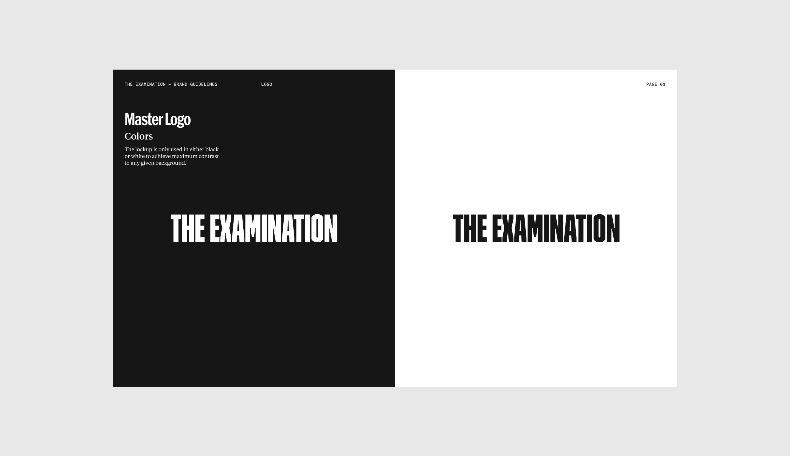
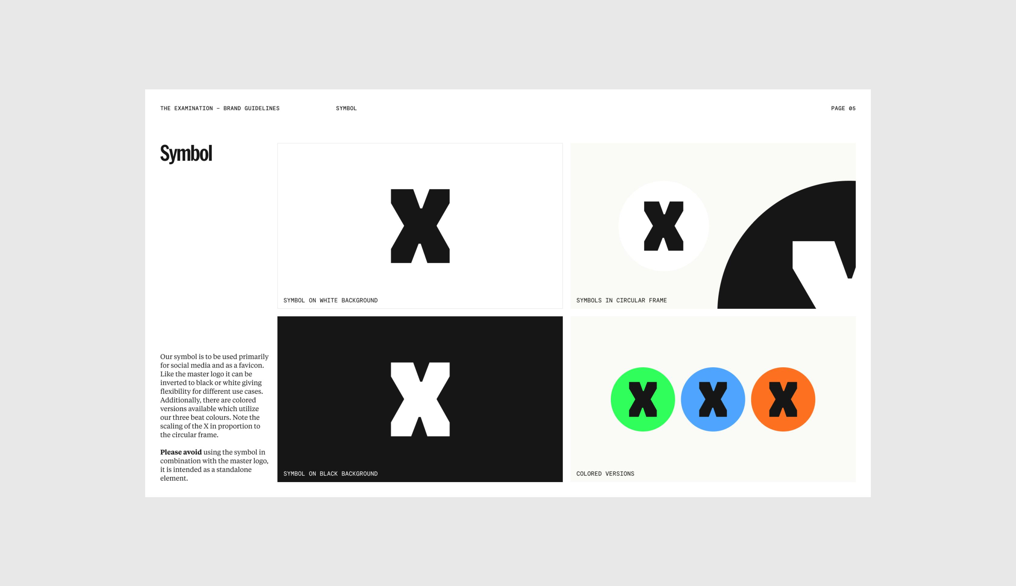
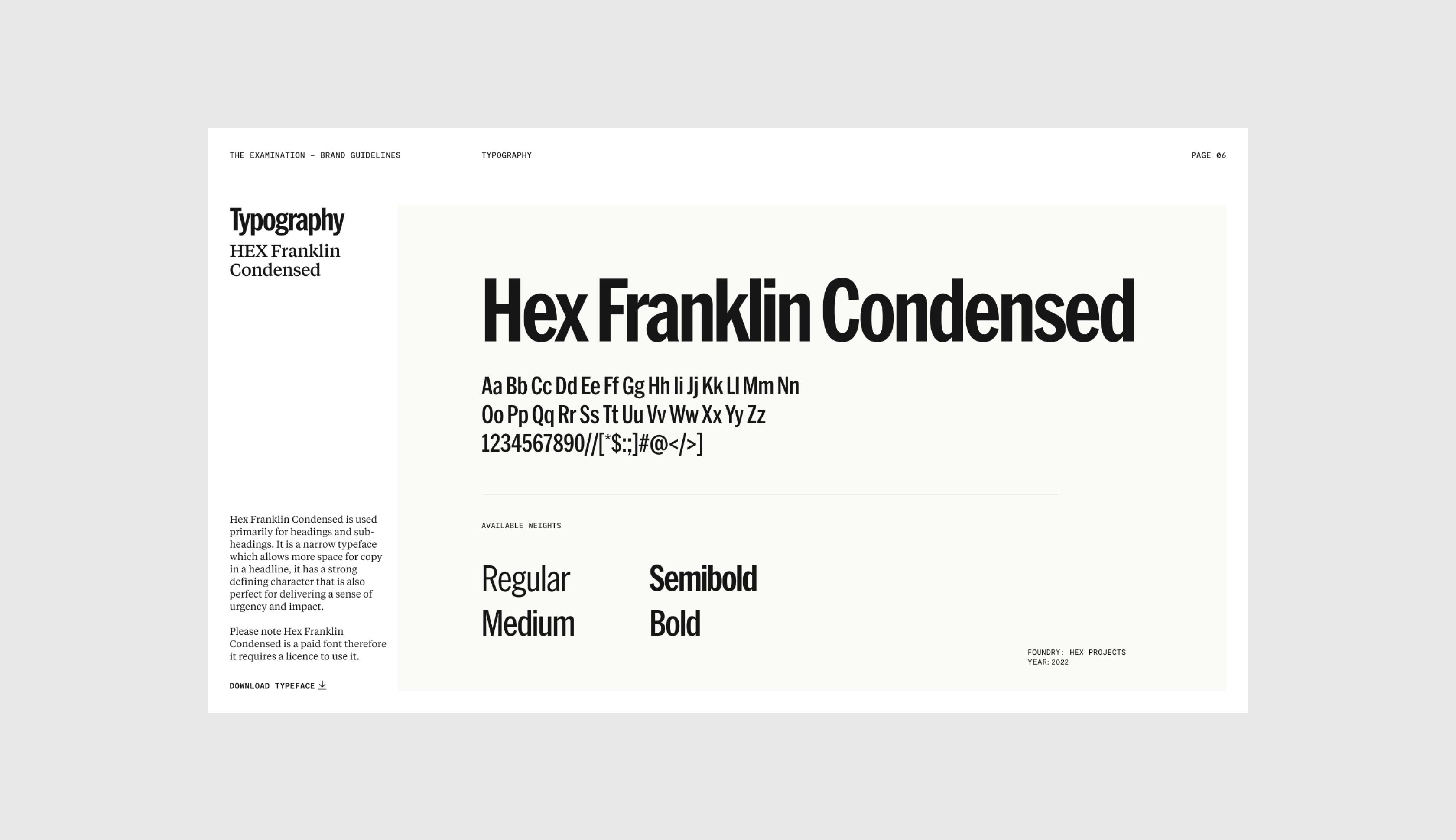
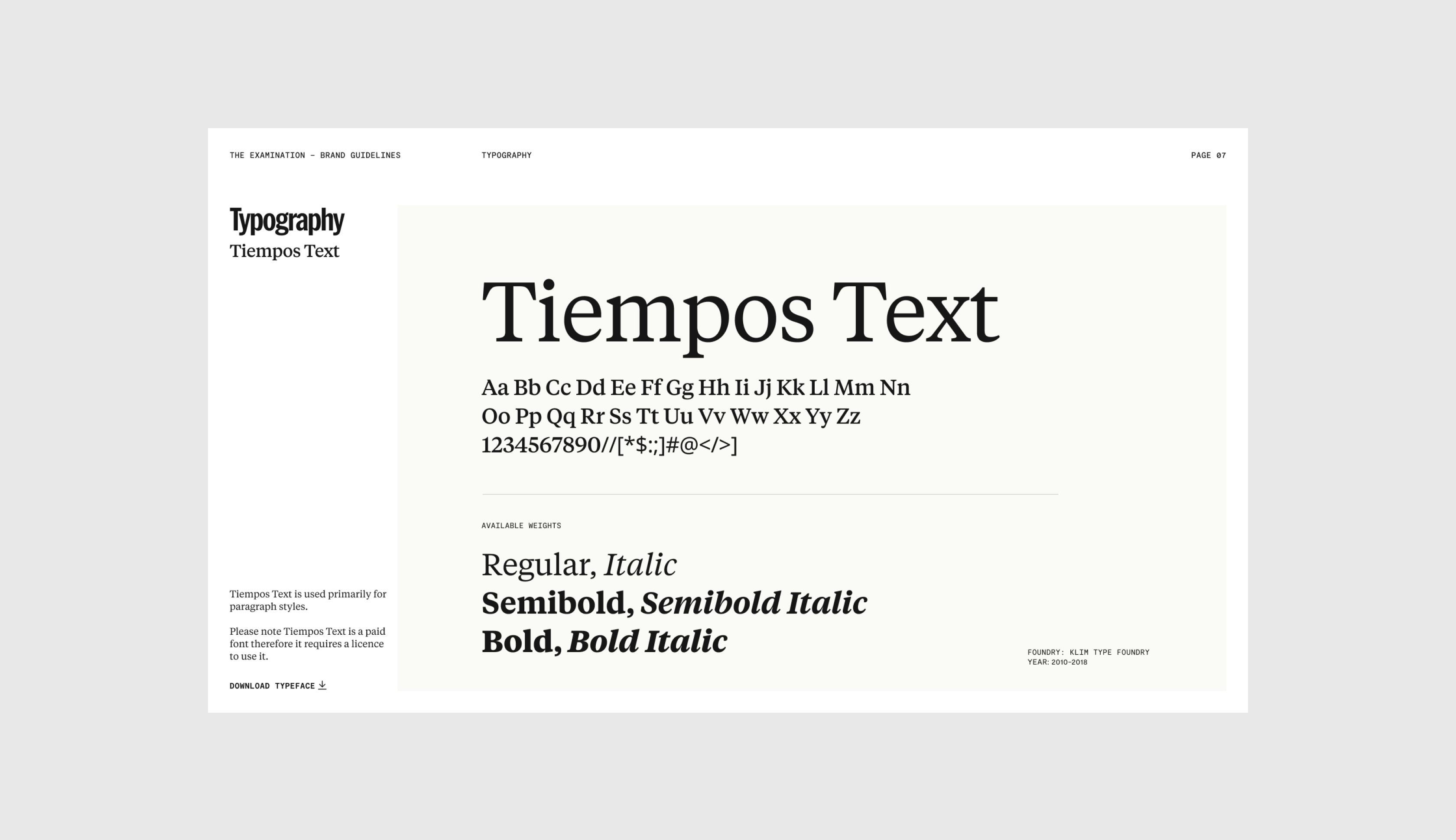
We crafted an identity system that feels as if a dossier of critical information has been placed in your hands. Organized. Essential. Prepared for you.
There's a sense of uncovering and revealing, of sliding open to reveal information in hidden documents. The bright colours of highlighted words bring a sense of urgency, drawing attention to key information.







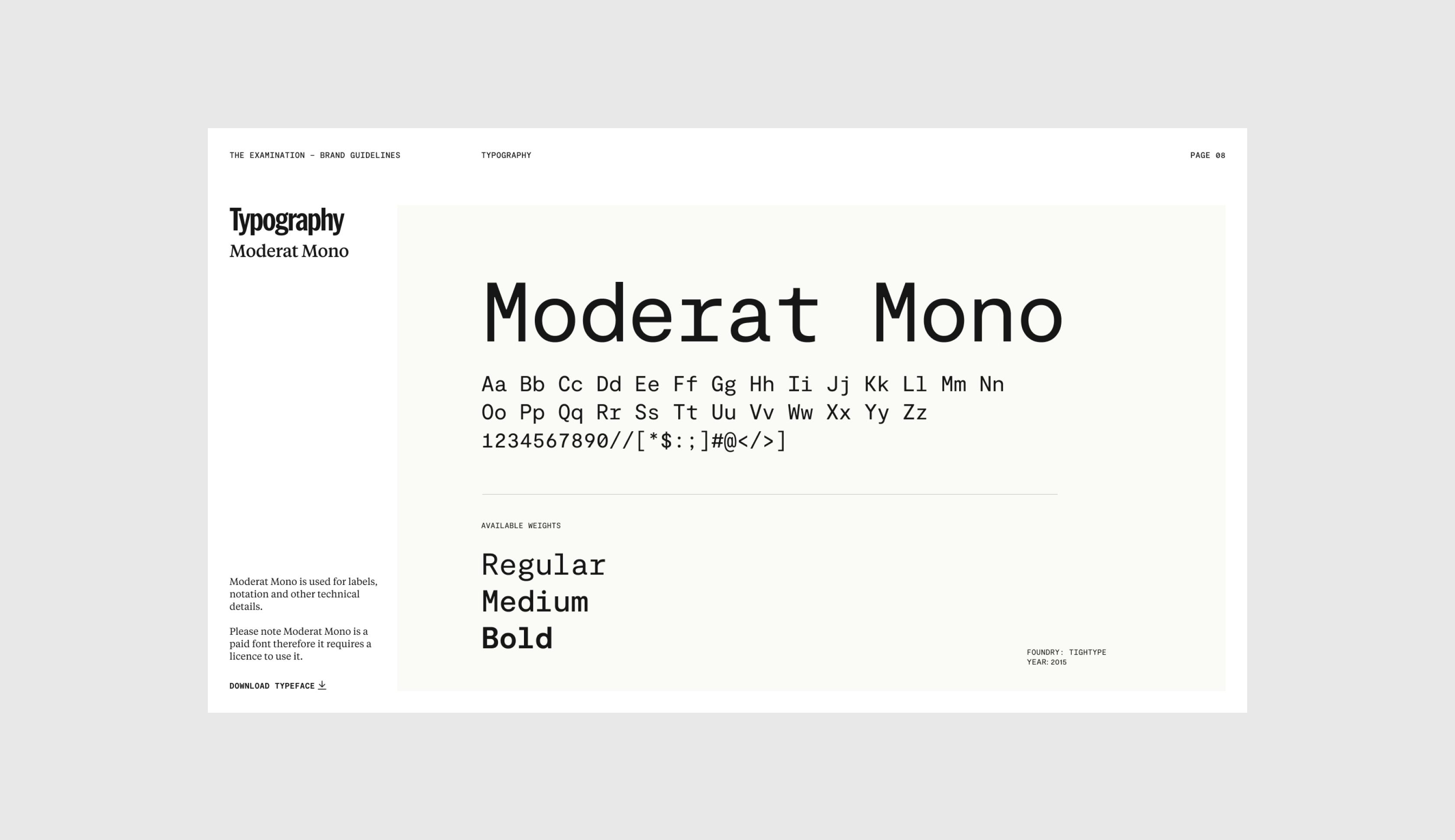

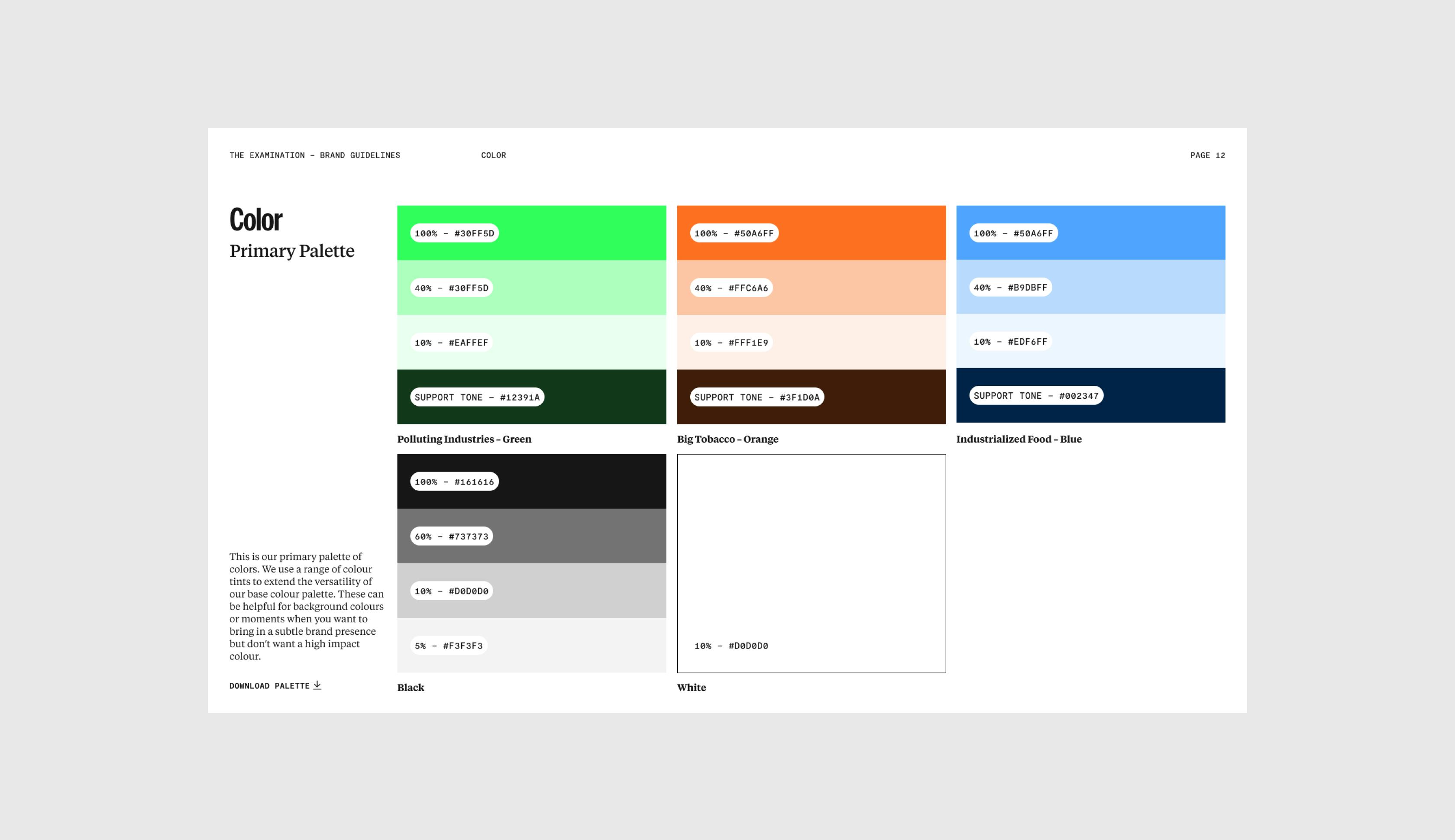

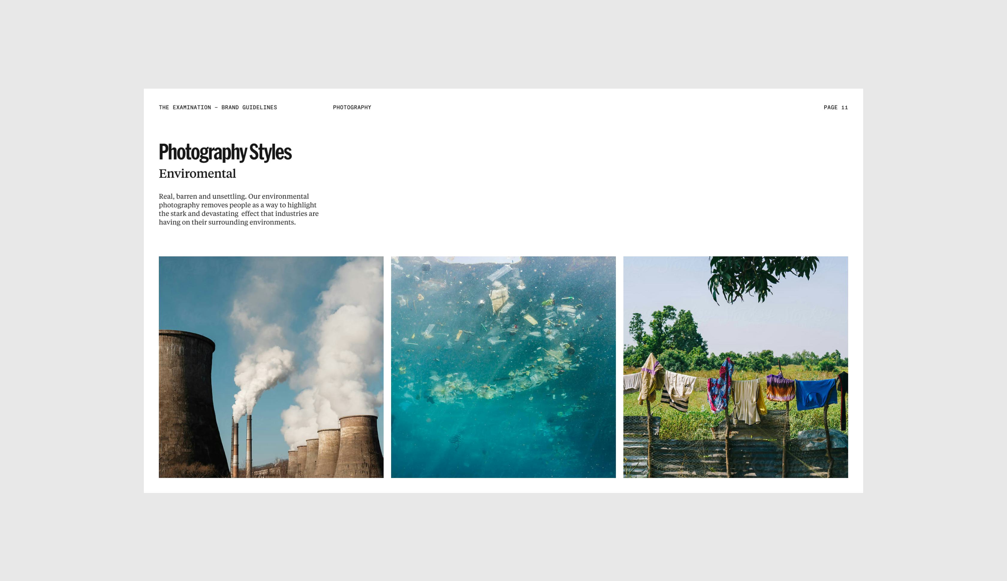
Designing the news
Gladeye has designed a series of award-winning long-form articles for publications including Rolling Stone, HuffPost and The Marshall Project. We’d developed a deep understanding of editorial storytelling but had yet to develop a journalism platform from the ground up.
We were excited to be able to realise this vision.
“We had a document of features that we wanted to build for Huffington Post… it was every cool thing that an editorial website could have.”
Nathan Walker
Designer, Gladeye




Big topics
Over time The Examination will grow to encompass many topics but beginning with the urgent health issues of Tobacco, Pollution, and Industrialised Food.
We faced the challenge of translating this broad array of topics into a visually cohesive, engaging website.

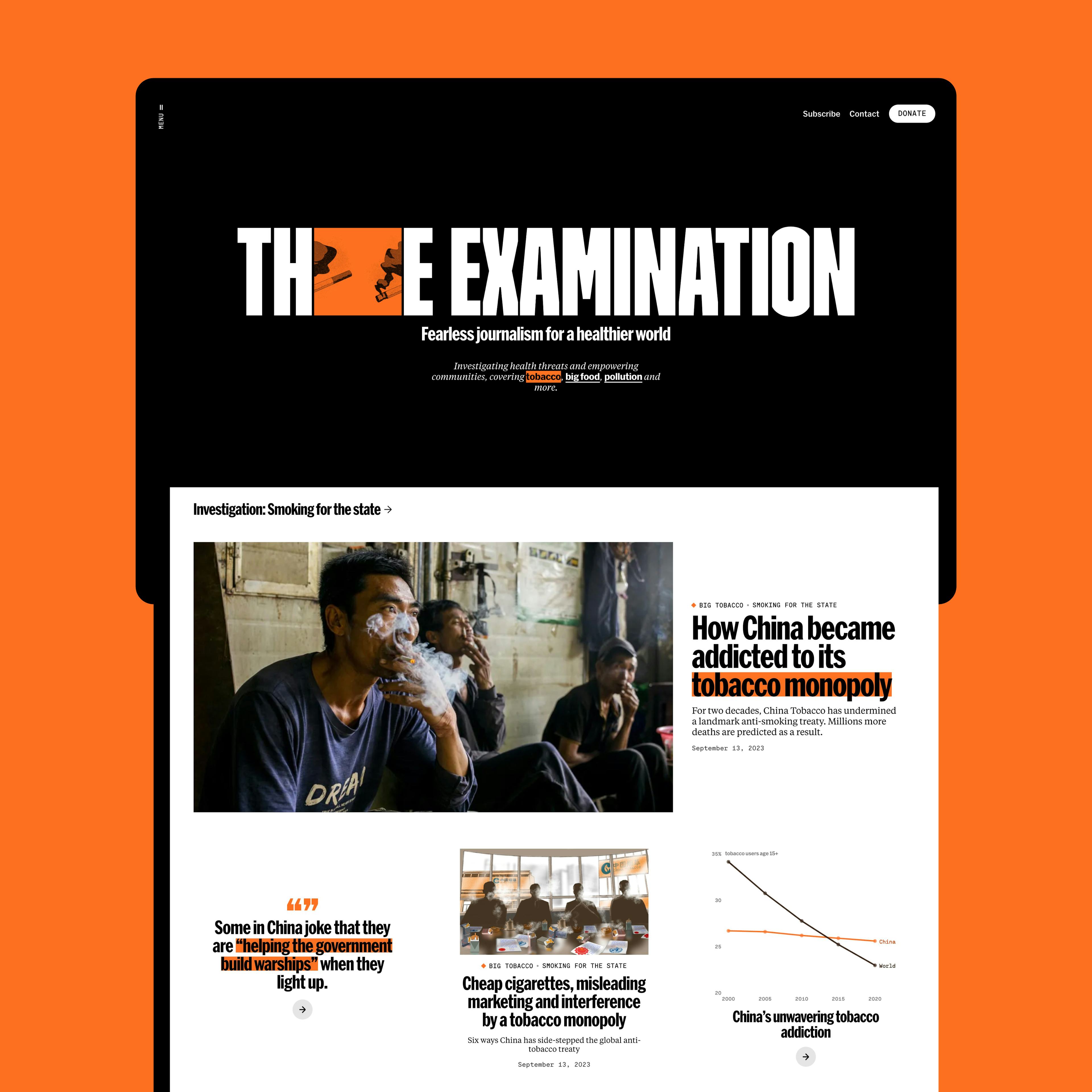

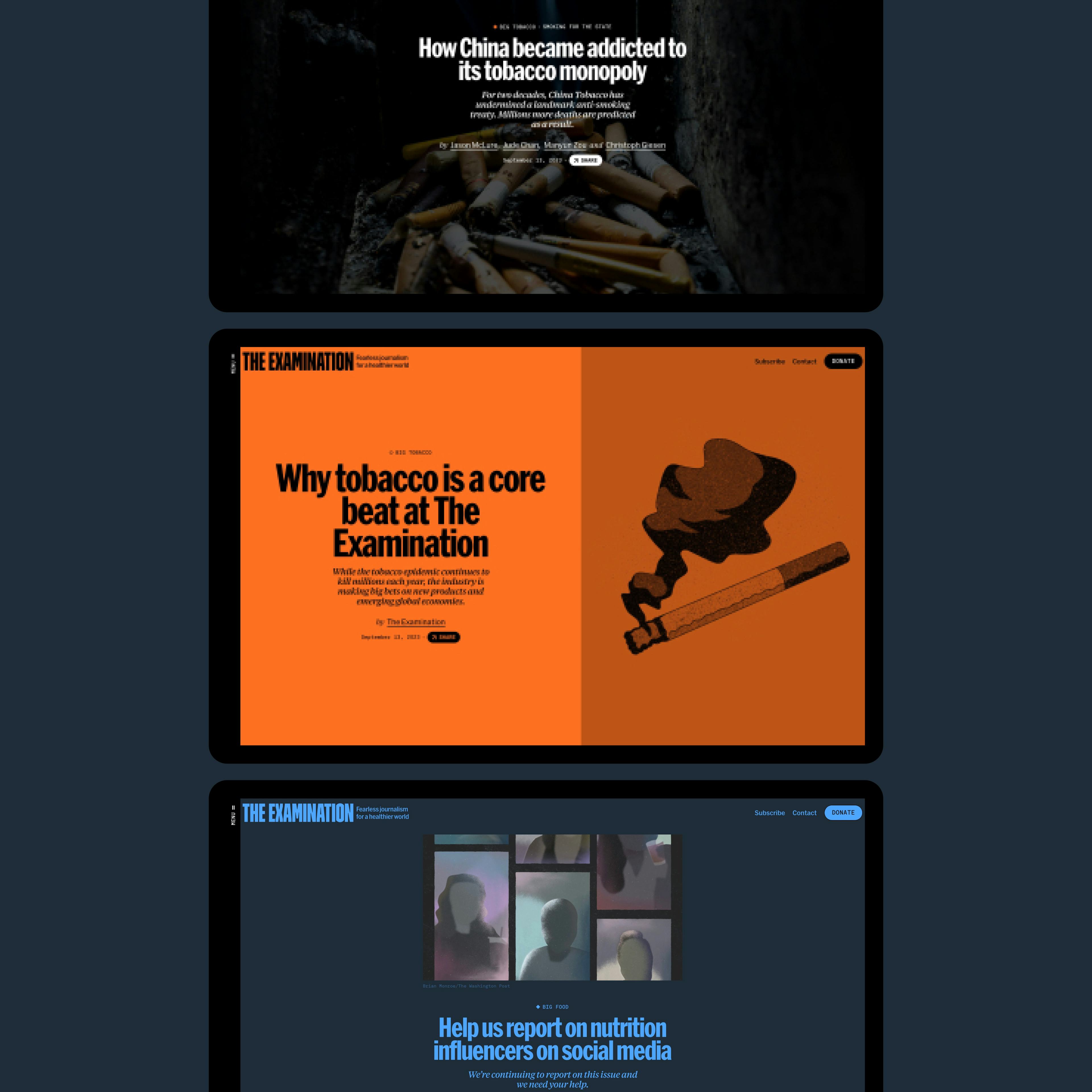

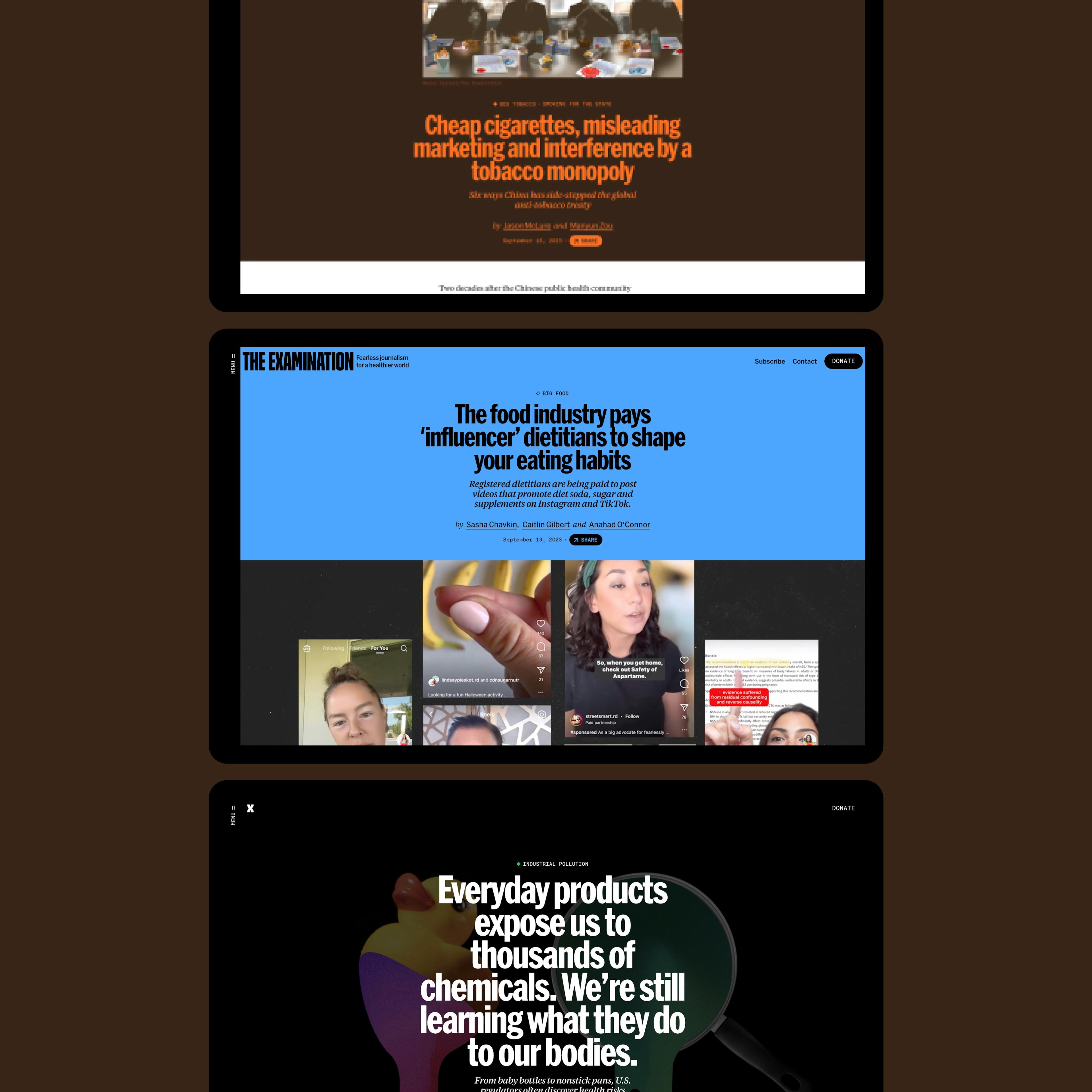

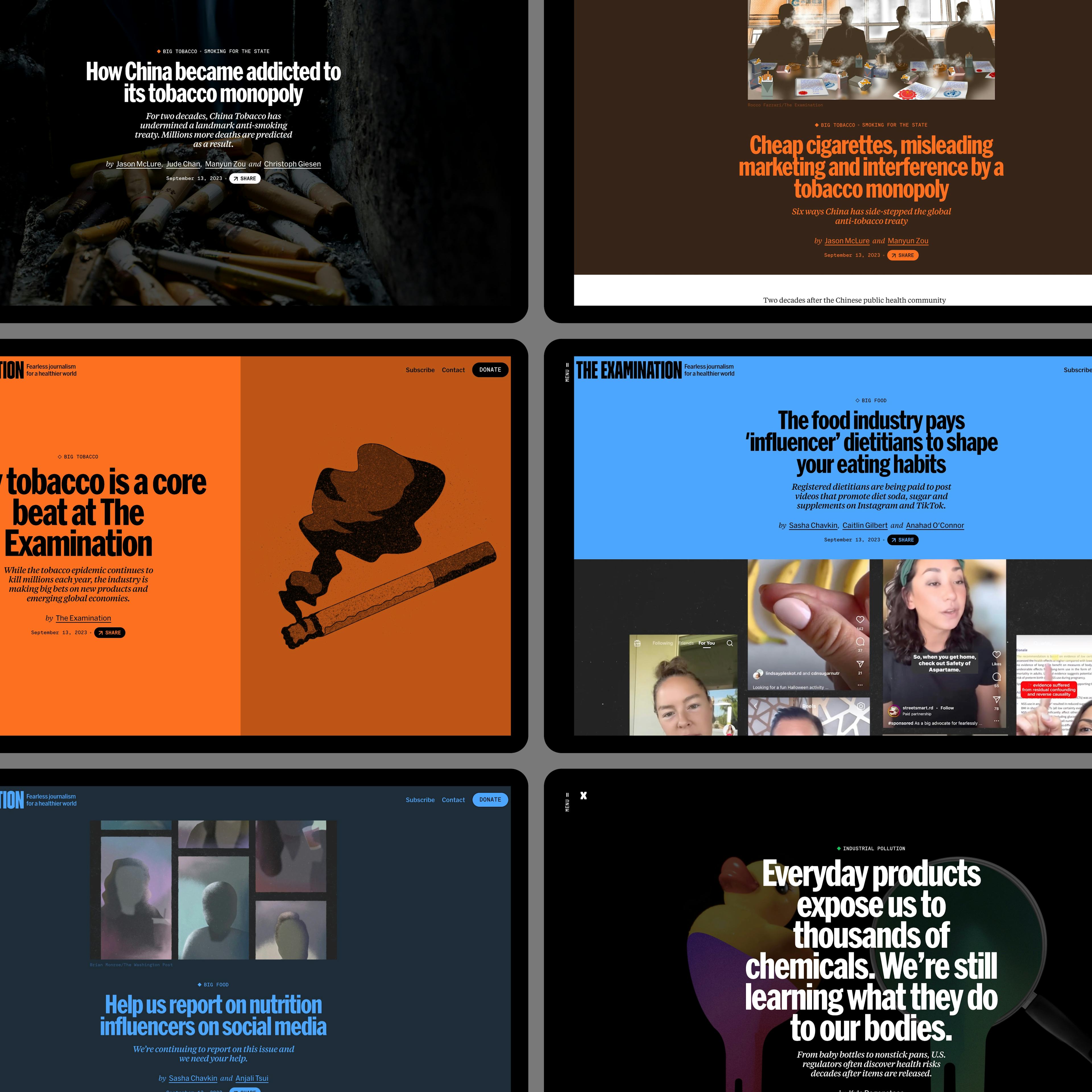




“We had to house many related topics and give them a unifying framework. ”
Nathan Walker
Designer, Gladeye
Standing out
The Examination exists to tell stories not told elsewhere.
As a new brand they saw the value of uniqueness - of standing out from the templated grid layout and category nav that is everywhere in digital journalism.
We looked to combine the monochromatic authority of The NY Times or The Guardian - with a sense of punk energy; disruptors of the status quo.
Boldness
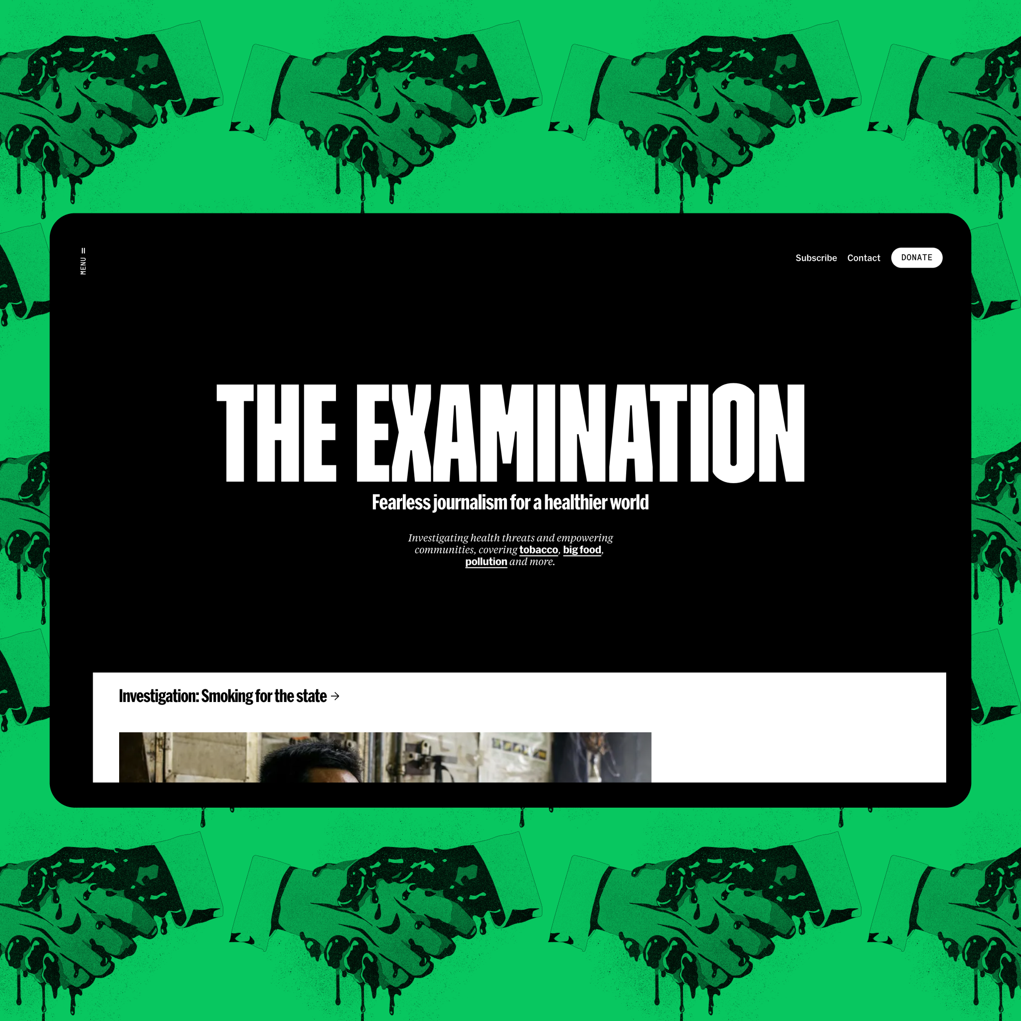
We want The Examination to be graphic - big type, big images, bold colour palette and illustration, but with a brilliant reading experience at the heart of it.
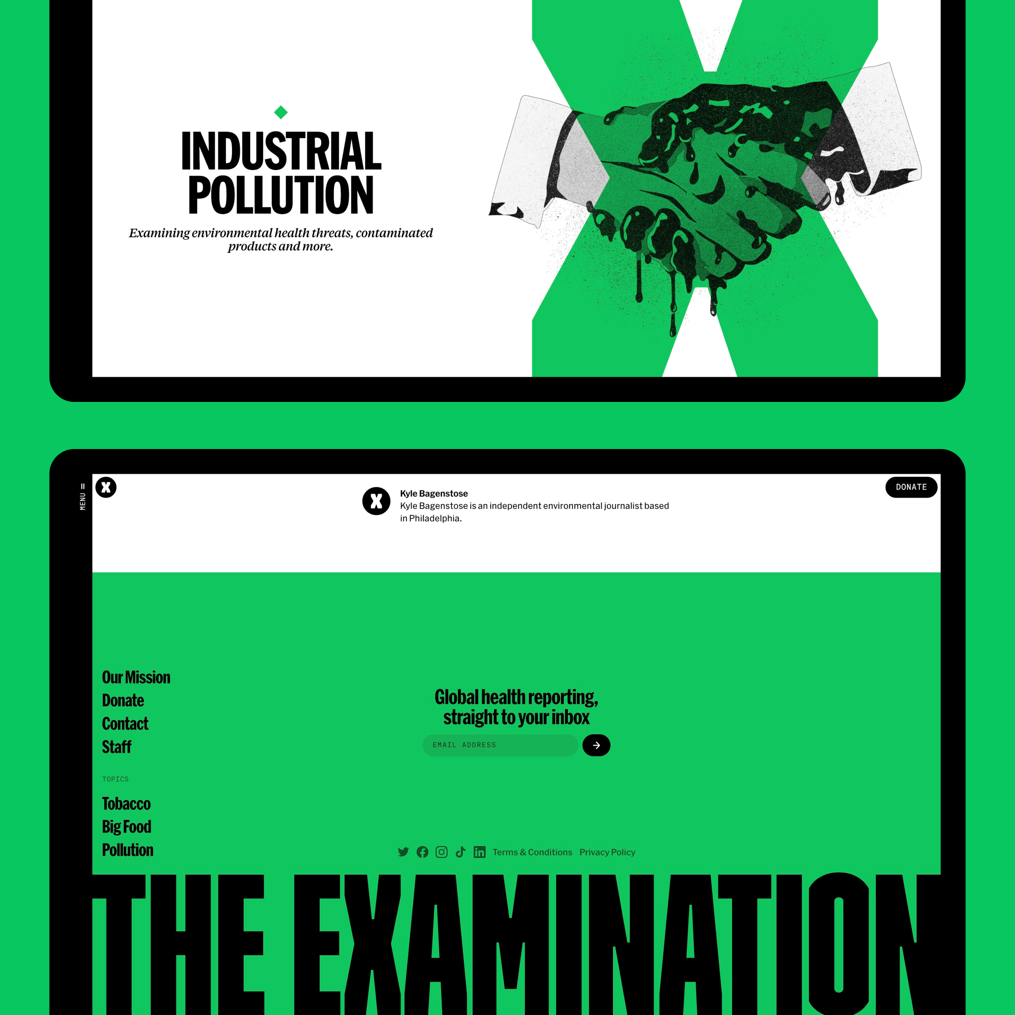
There is a sense of uncovering secrets in the site's animations and interactions. Topics are presented as sliding drawers, creating moments of discovery for the reader as they unlock new knowledge.



Color themes
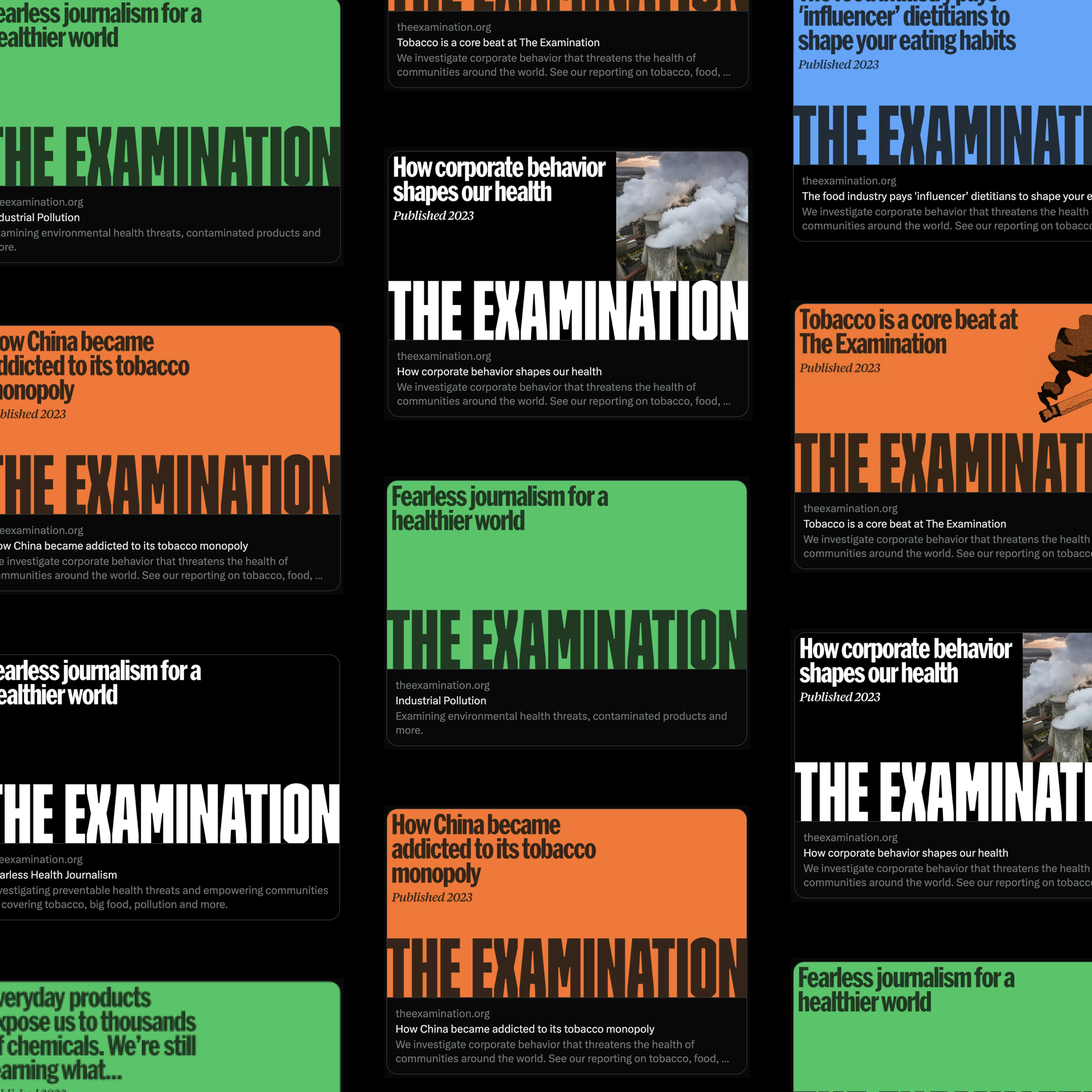
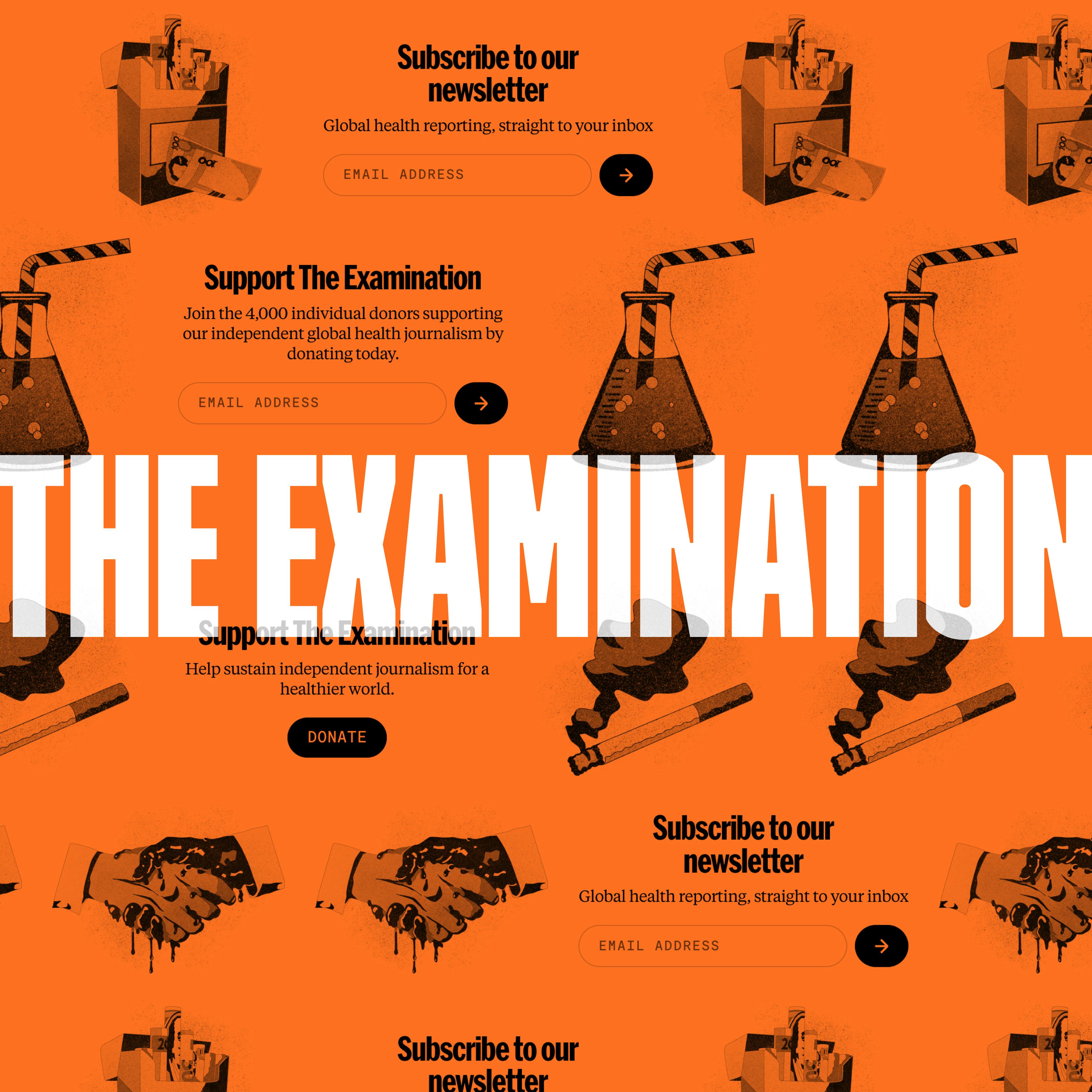
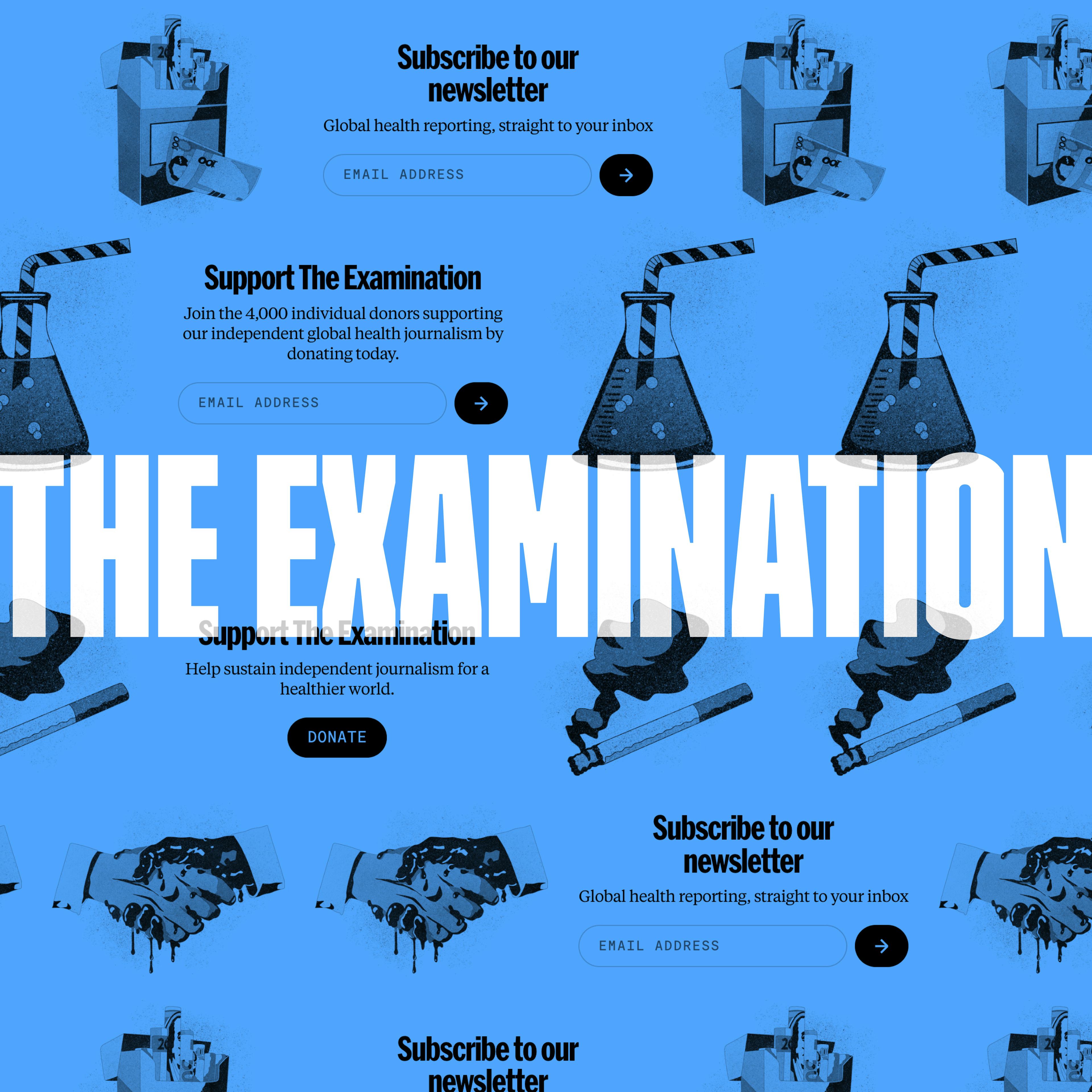
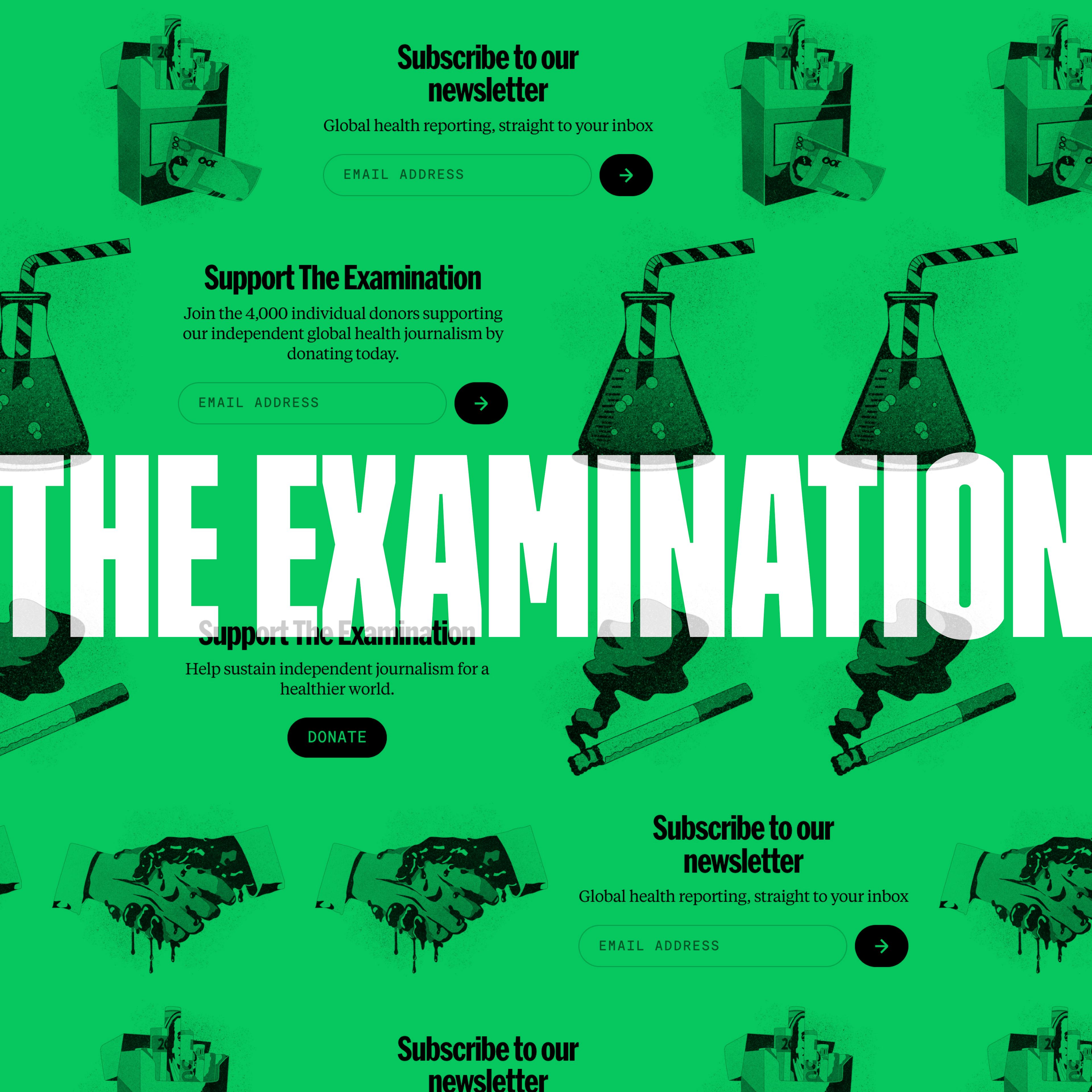
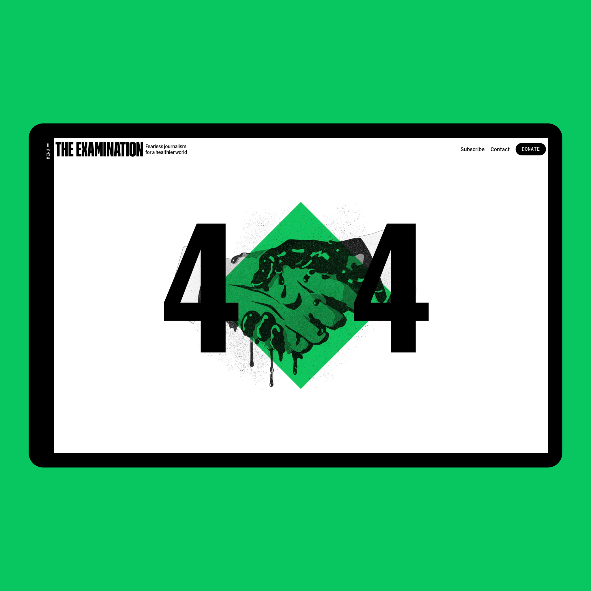
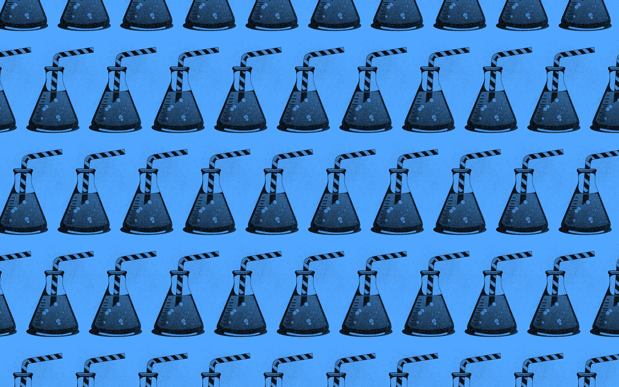
Each topic has its own theme colour, flowing throughout the UI design and allowing readers to easily find what they connect with on return visits.
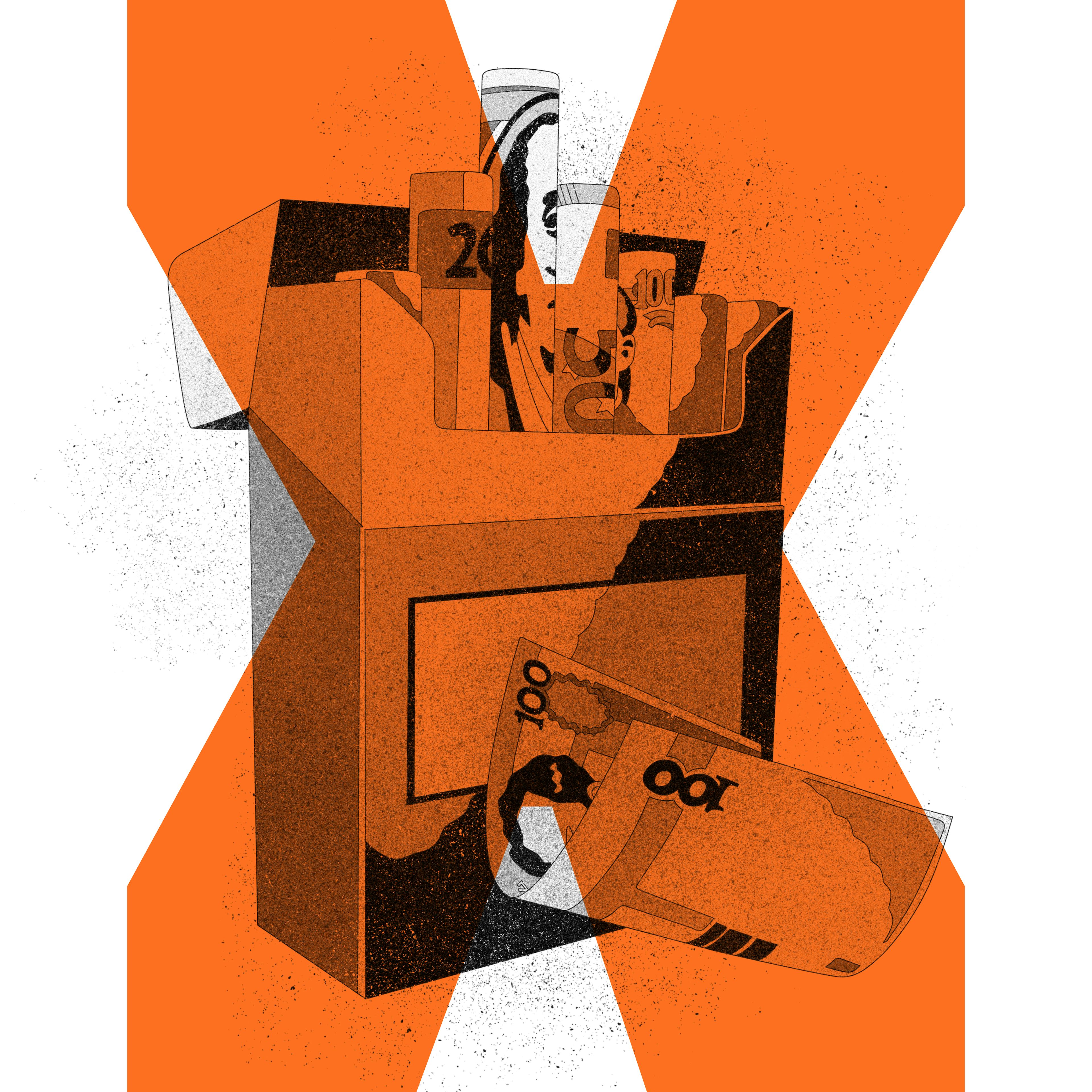
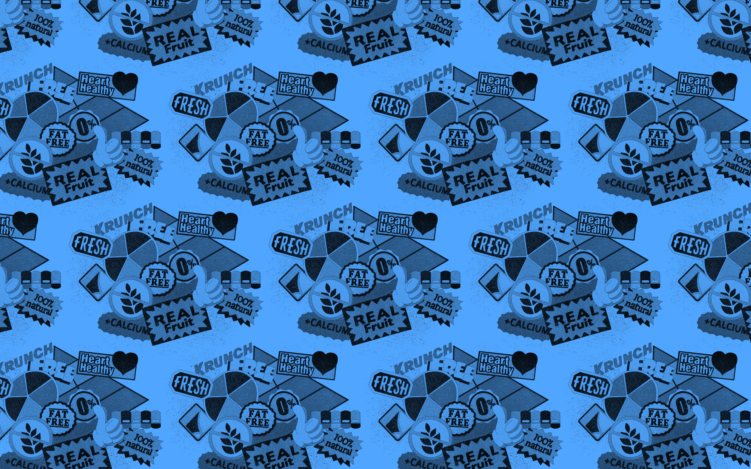
To complement this brand language our Illustrator, Pablo Espinosa delivered striking visuals for each topic. Simple and graphic, they provide a sense of grit to balance the sleek designs.






Connecting the dots
The Examination articles will often expand into series or follow-ups. We’ve laid the foundation in the first release for a powerful feature called “Objects of Interest''. Initially these are footnotes allowing you to follow characters across different stories.
They’ll grow into their own “dossiers”, where you can explore every article, quote and reference tied to corporations, individuals and their actions over time.
Flexible platform
Storyblok has the ability for live previews of a headless website - a powerful feature which makes editing content far more tactile. We work closely with clients to align our CMS configuration with their workflow, and The Examination was no exception.
It’s an interactive space where serious journalism meets beautifully flexible digital design. The editorial team are also able to integrate themed Datawrapper infographics, charts and other elements directly into the flow of articles.