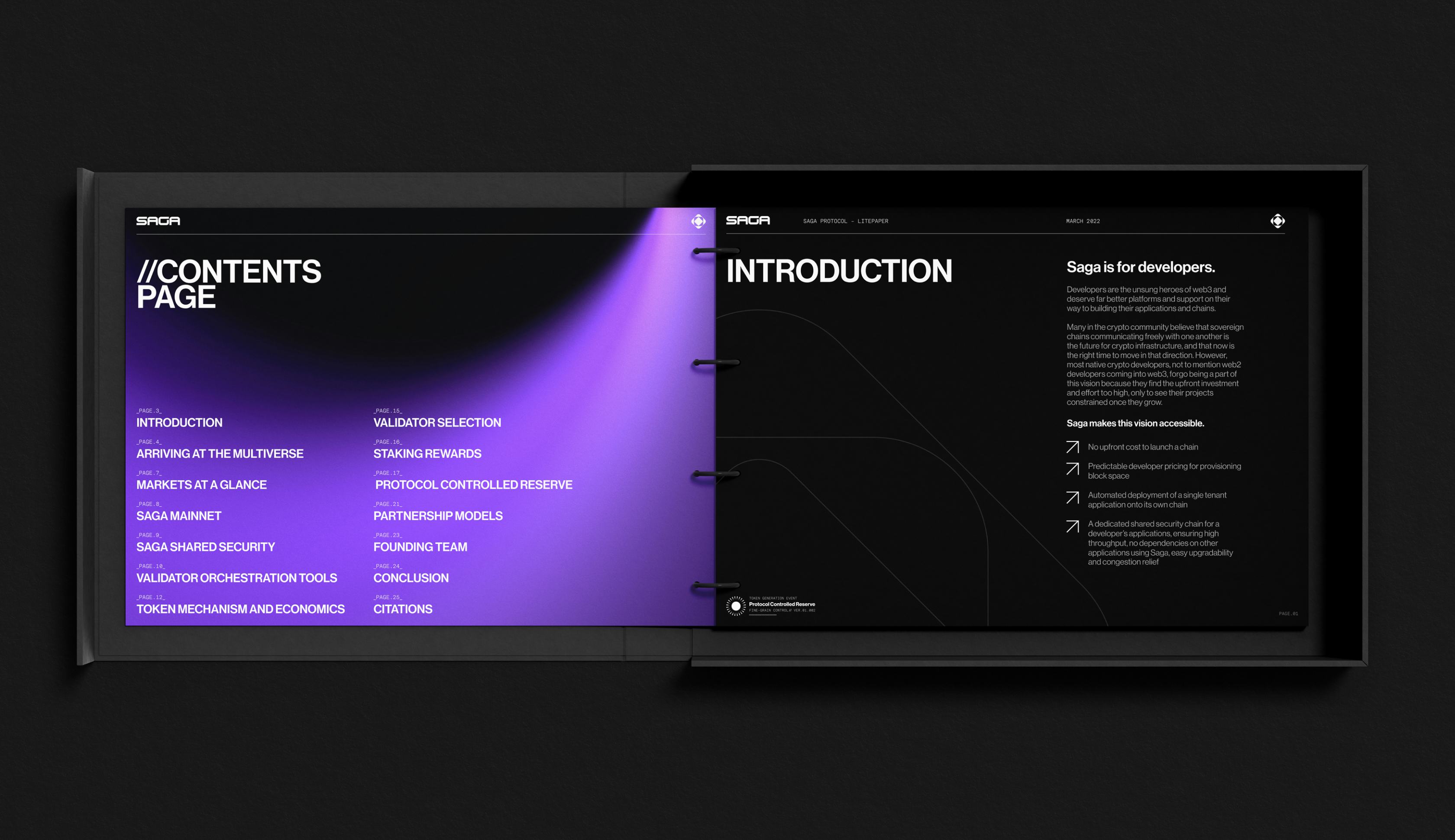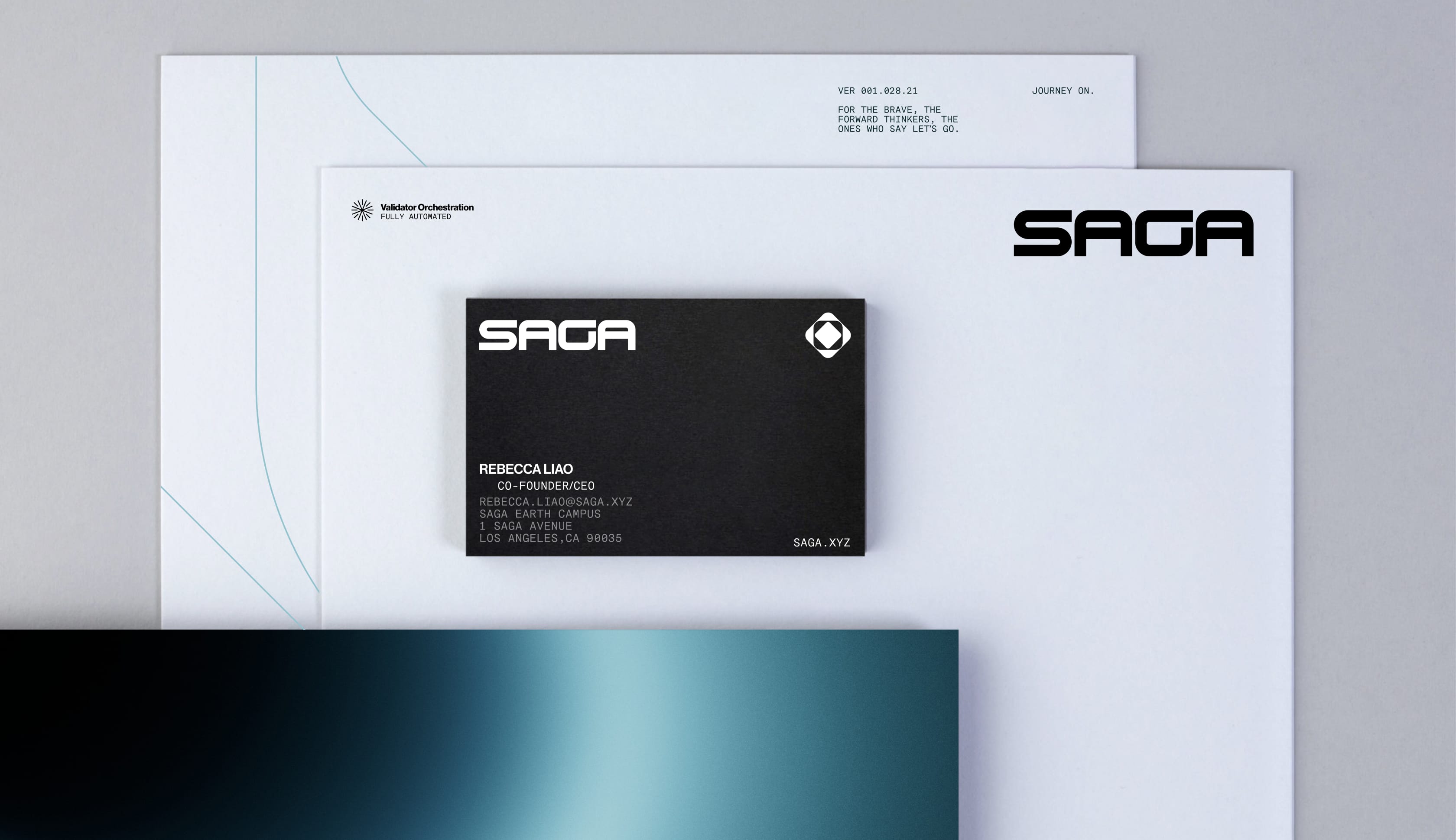



Saga - Brand
The hero's journey in web3 starts with Saga
Saga are empowering the next 1,000 blockchains in the multiverse. By offering founders and teams sovereign blockchains underpinned by a shared security layer of validators on the Cosmos ecosystem.
They needed a new brand identity that would take them to the moon, and beyond.
Building heroes
Blockchain and crypto can feel like a secret club that actively repels outsiders from behind an impenetrable veil of tech-slang.
Saga by contrast wants to draw in as many new people as possible, accelerating blockchain into mainstream adoption.
How? By making it simple for ambitious founders and teams to build on powerful, flexible blockchains. Their product success will expand Saga's ambition to become the AWS of blockchain.

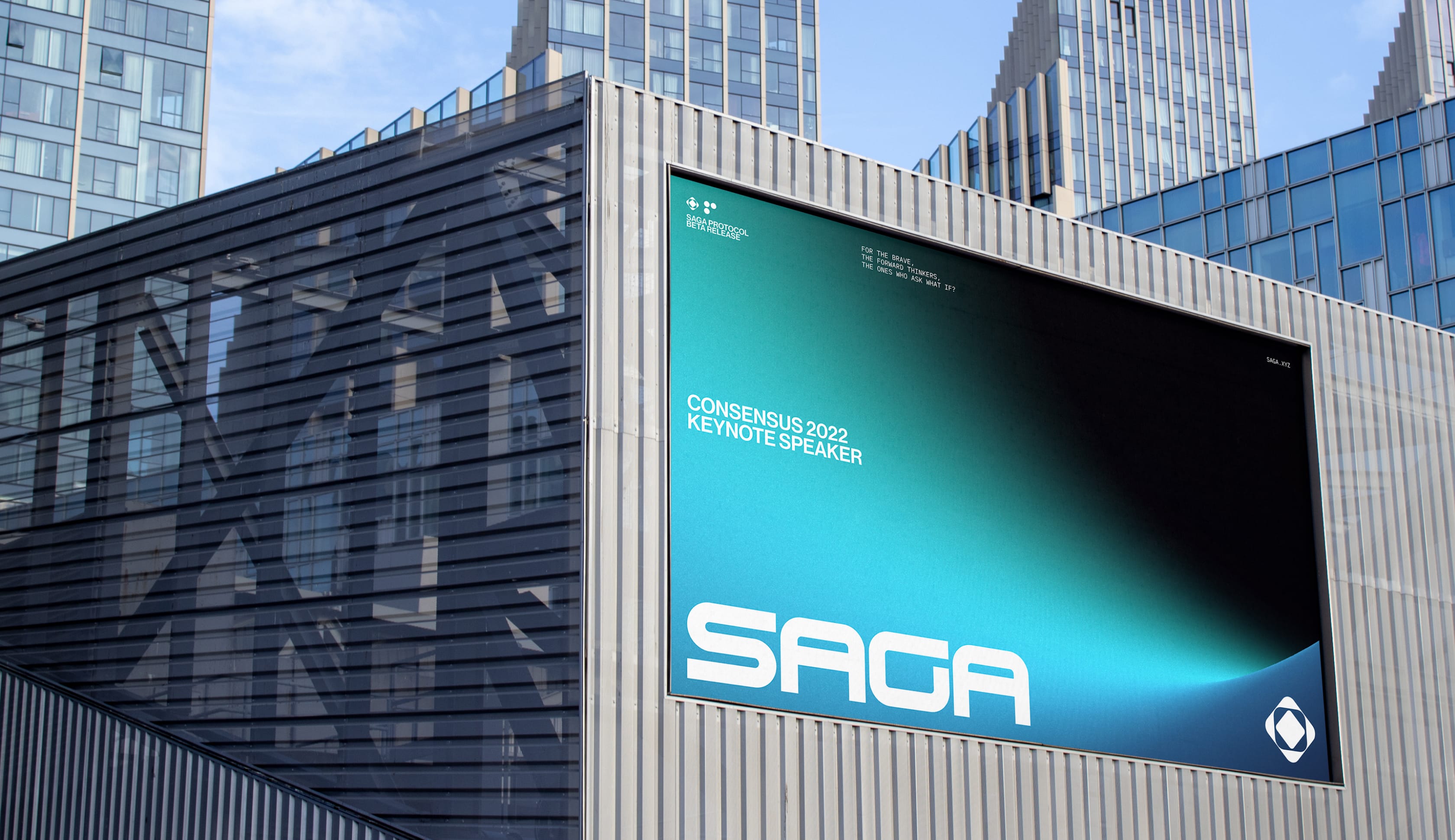

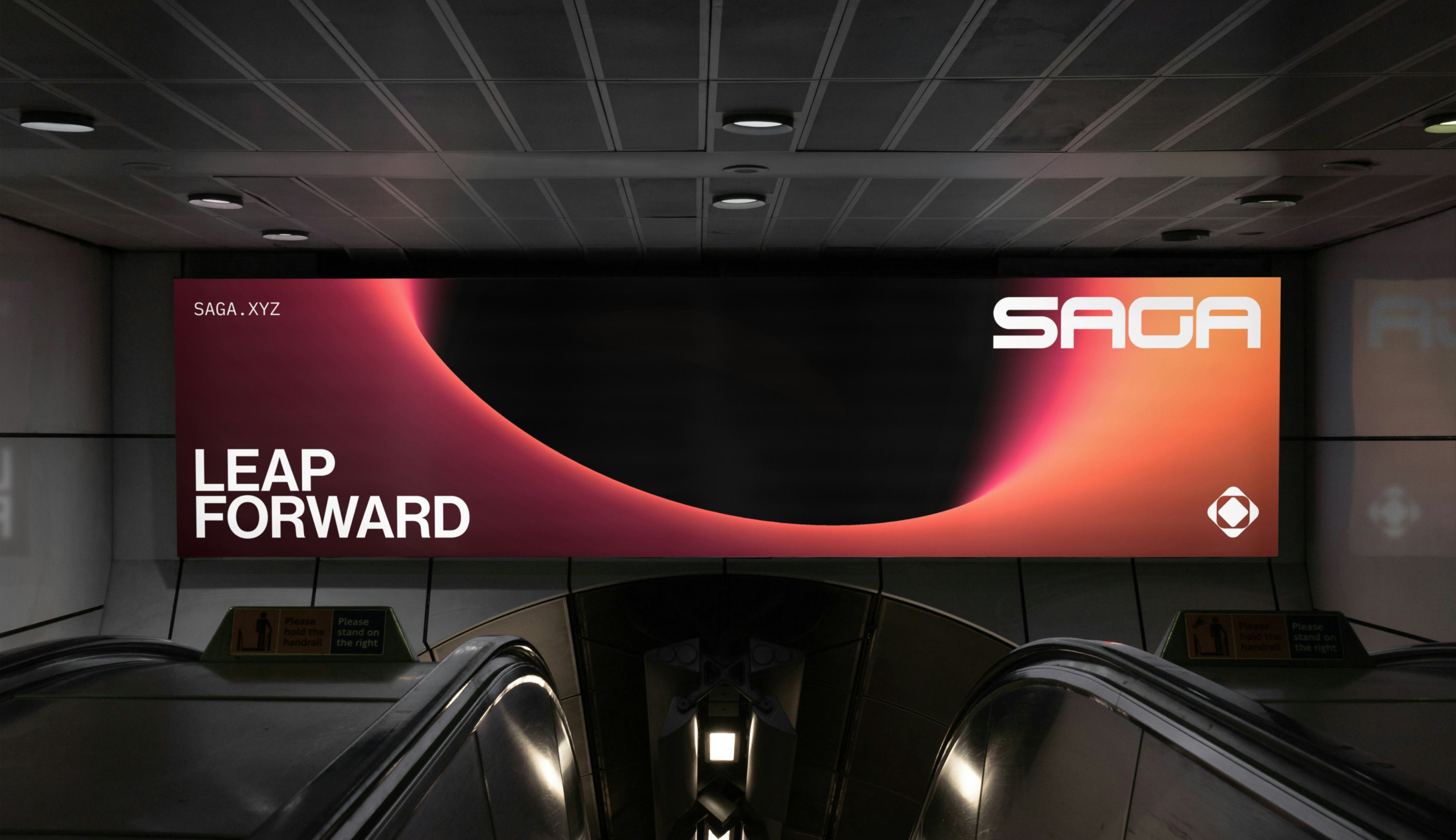
Into your journey
To attract these founders, we crafted a brand strategy around “The Hero’s Journey”, the archetypal framework of adventure and transformation.
After exploring multiple creative territories, we became intrigued by a visualisation of Albert Einstein's theory of general relativity resembling a tunnel between two points in space-time, The Wormhole.
This became the central brand motif. A way to travel instantly from your moment of inspiration to the ultimate success.

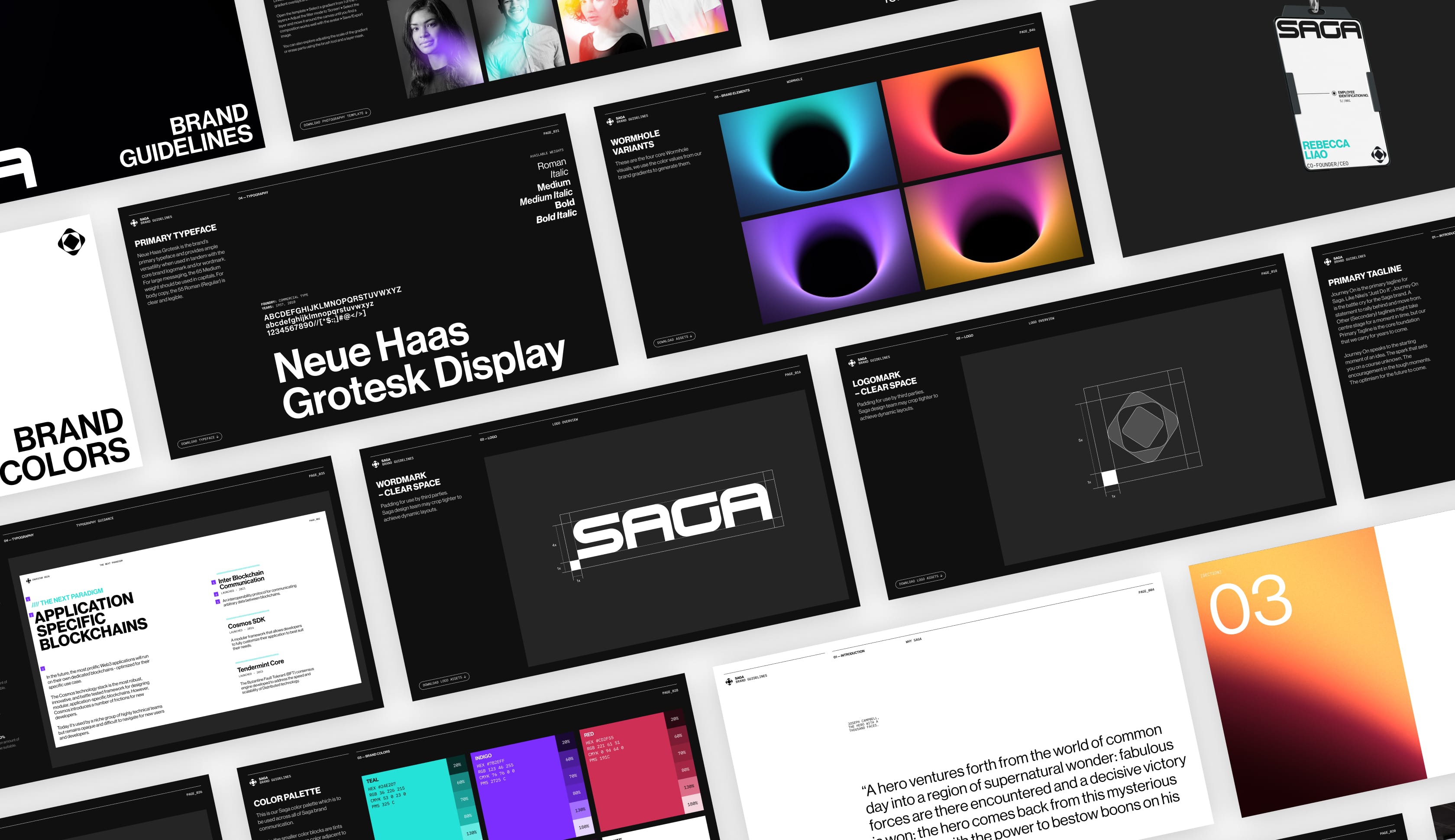
Space opera
We wanted to reflect the grandeur and optimism of 1960’s sci-fi in our brand visuals, they are deliberately vast, inspiring.
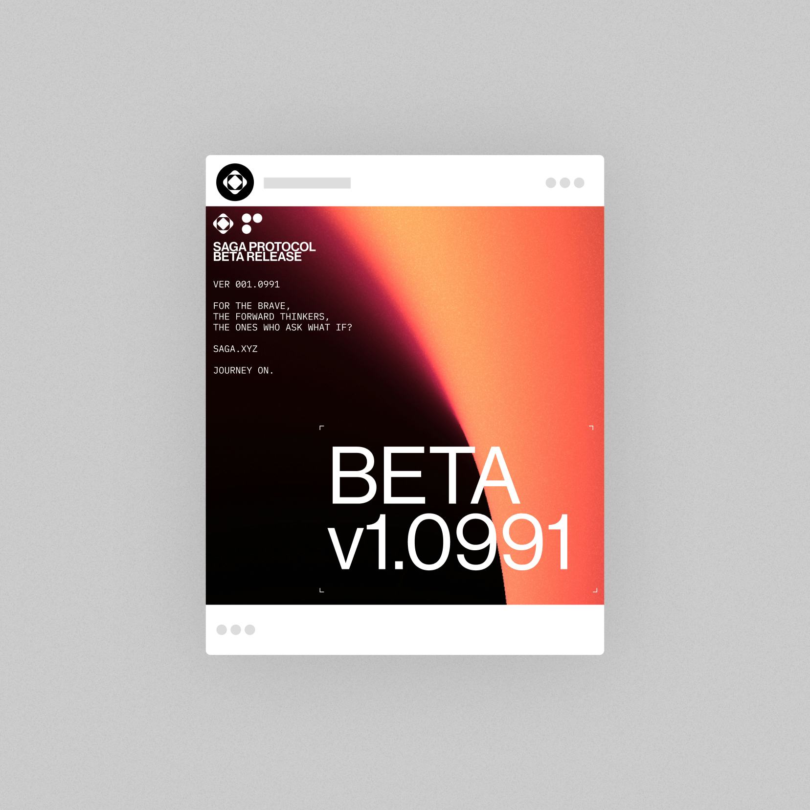
The wormhole motif is inspired by colours from spacecraft afterburners and light warping around a black hole; blooms of colour in the darkness of space.
“Saga should feel like a journey from the everyday to the incredible. ”
Michael Cannon
Brand Designer, Gladeye










The wormhole
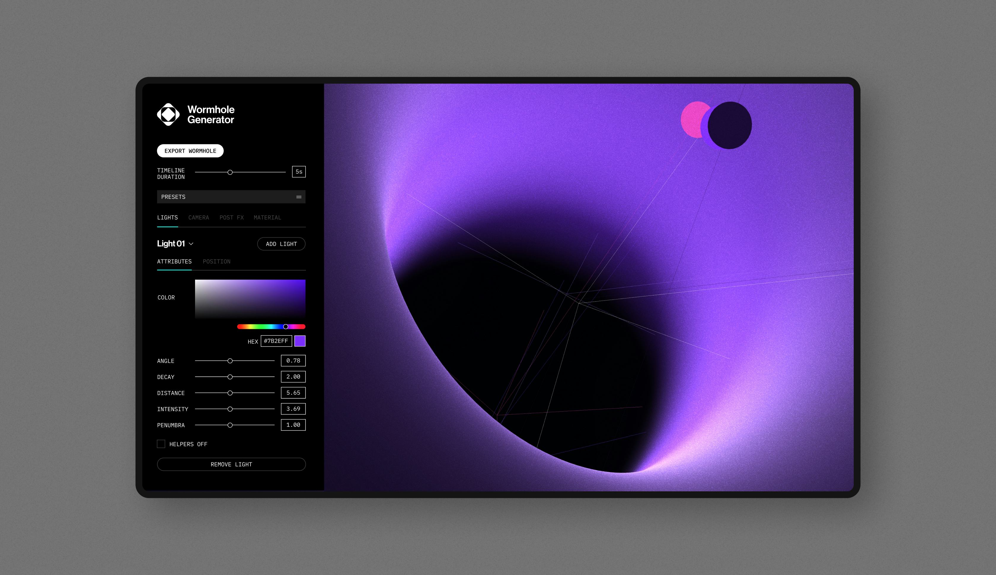
We created a browser-based app that can generate Wormholes, either static or animated. We have control in 3D space of its position, angle, lighting, on-brand colours, and even bloom and decay.
Using this original software, Saga is able to generate a virtually infinite set of unique Wormhole motifs.

Infinite chains
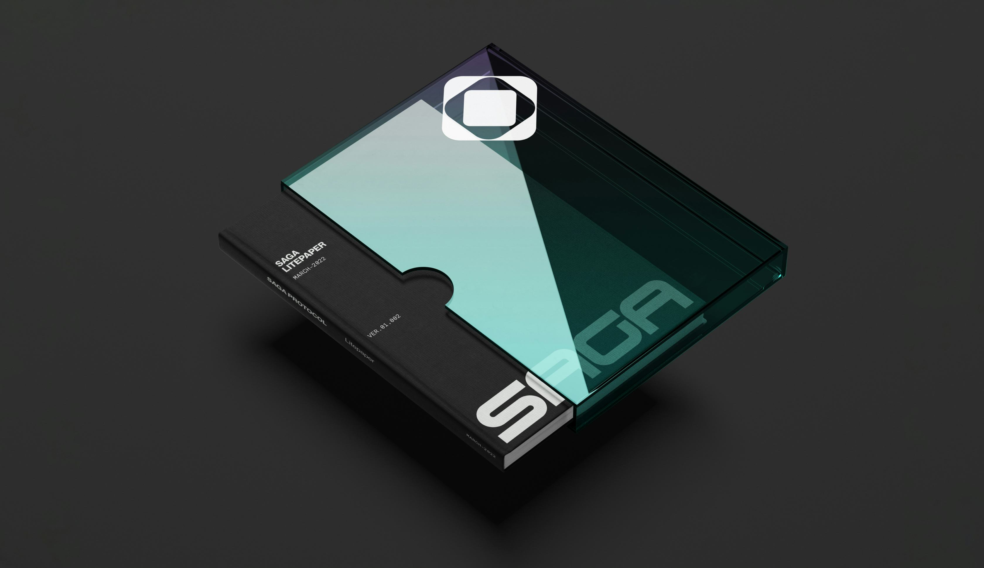
The logomark is inspired by the actual mechanics of their blockchain platform, as they spin up smaller blockchains (chainlets) within larger ones, and we wanted to show the infinite potential of these blocks within blocks.
Both the wordmark and logomark are animated to reinforce this story.



Space is the place
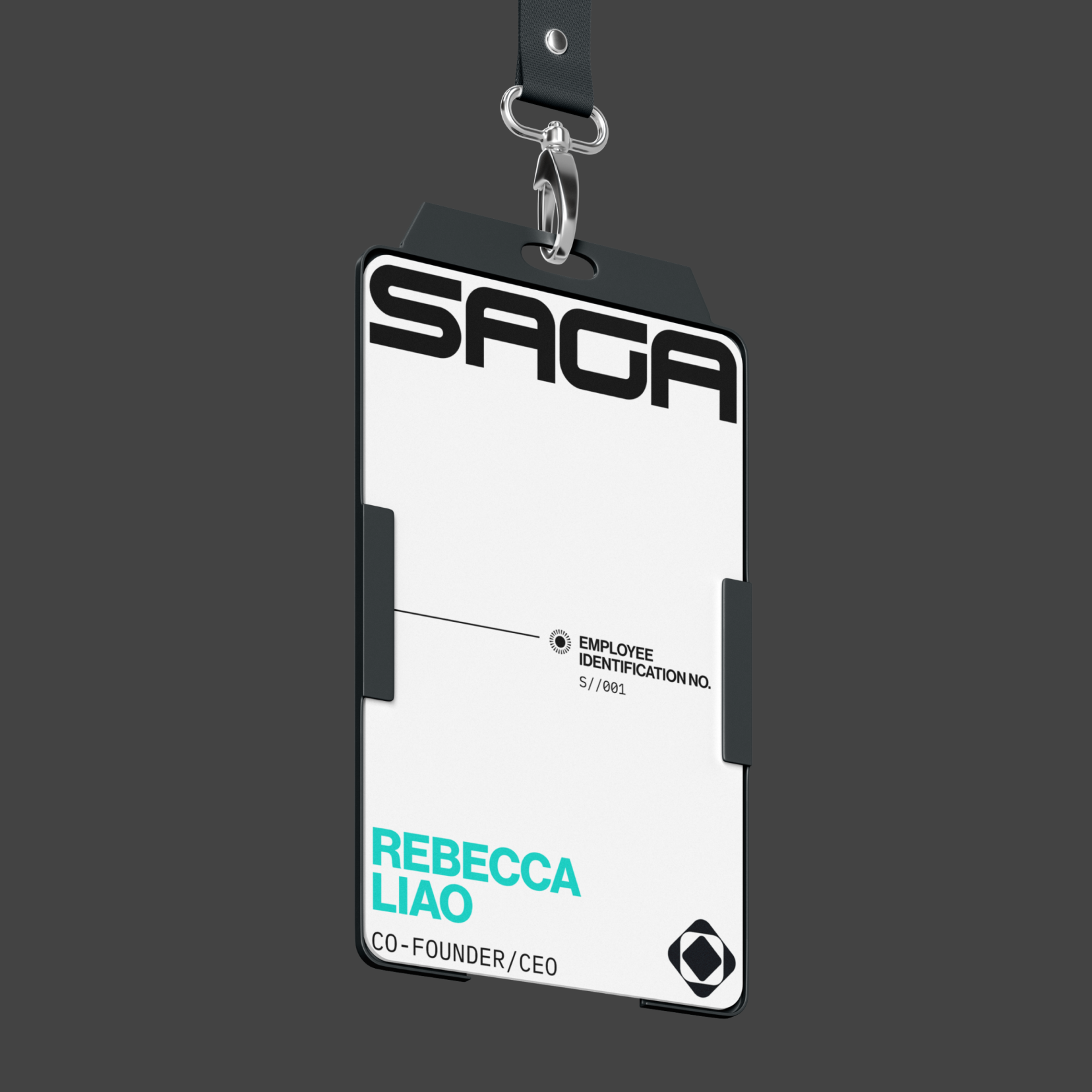
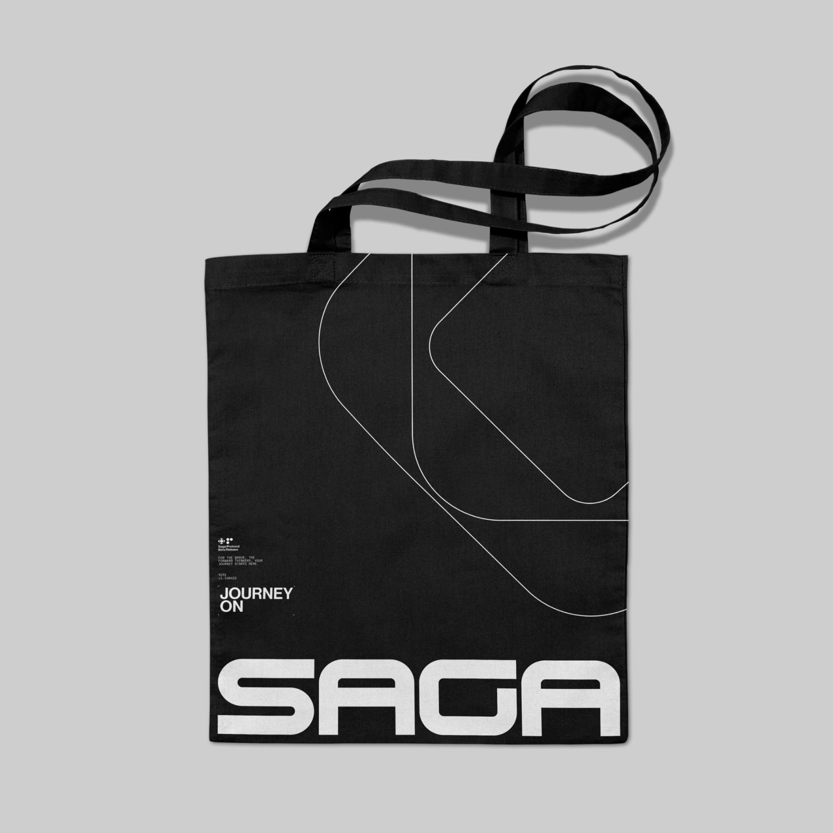
We used black and white as the foundation of the Saga brand identity, a framework in which startups can generate their own incredible journey.
The Saga wordmark itself has nods to pioneering video game brands like Sega and Atari in its forms, also taking inspiration from the brand language of science fiction movies.
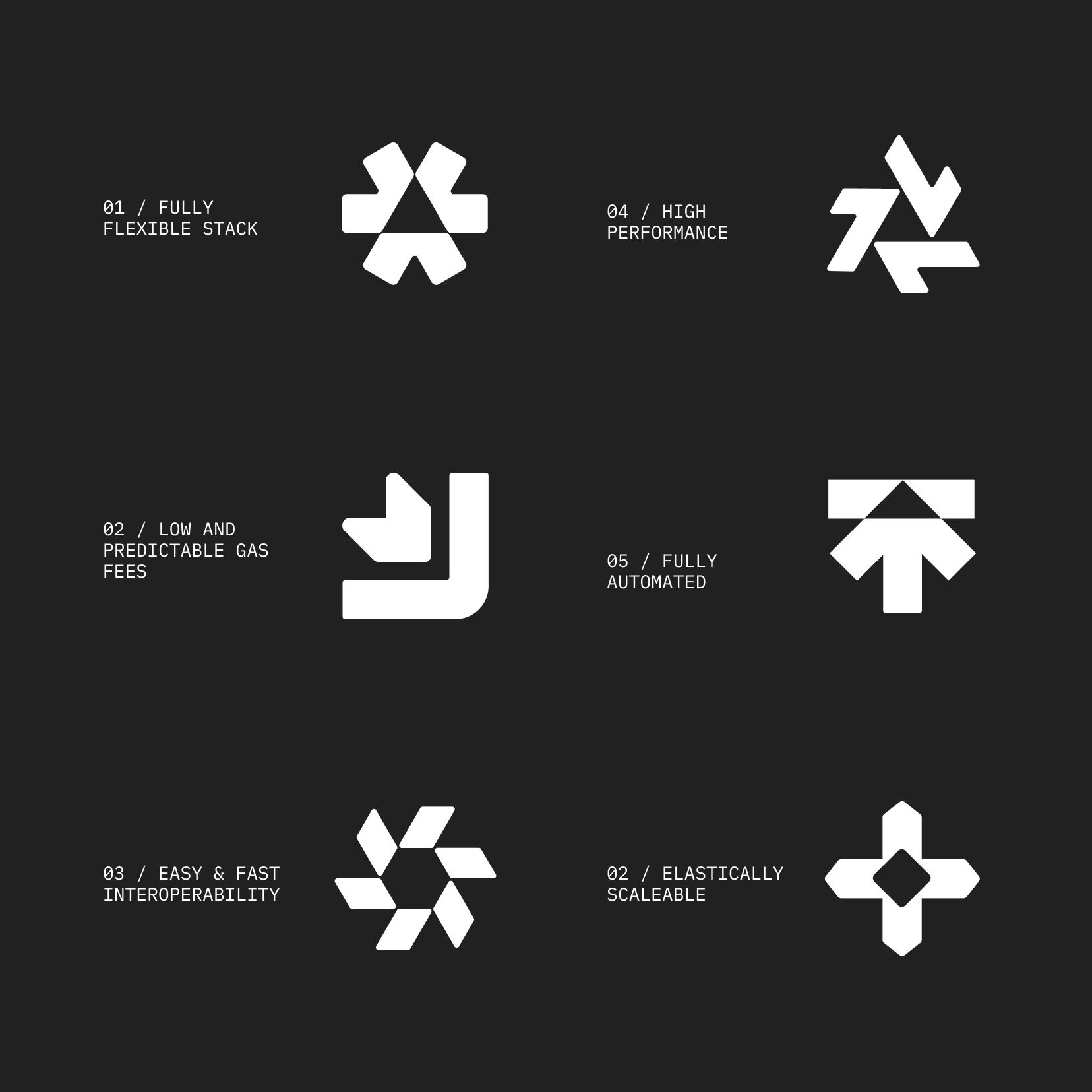
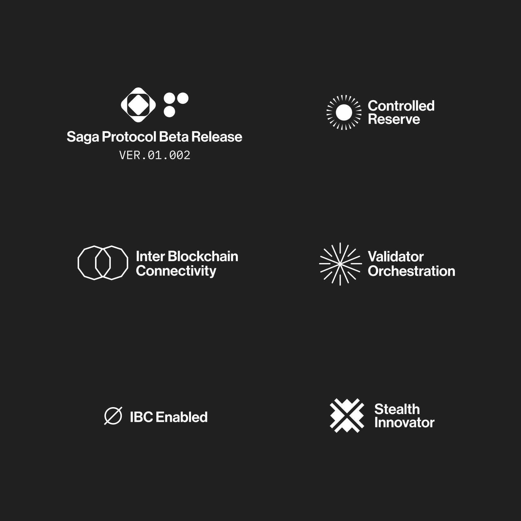
The typography and our original icon sets are inspired by the early identities of space exploration orgs likes NASA and JPL.

