


MitoQ
Redefining cellular health with vibrancy and emotion
MitoQ are creating a new wellness category of “Cellular Health”, a mitochondrial supplement that empowers health at the deepest level - inside cells.
Communicating this in a clear way and showing the positive impact on everyday life was a beautiful design challenge.
Everyday moments
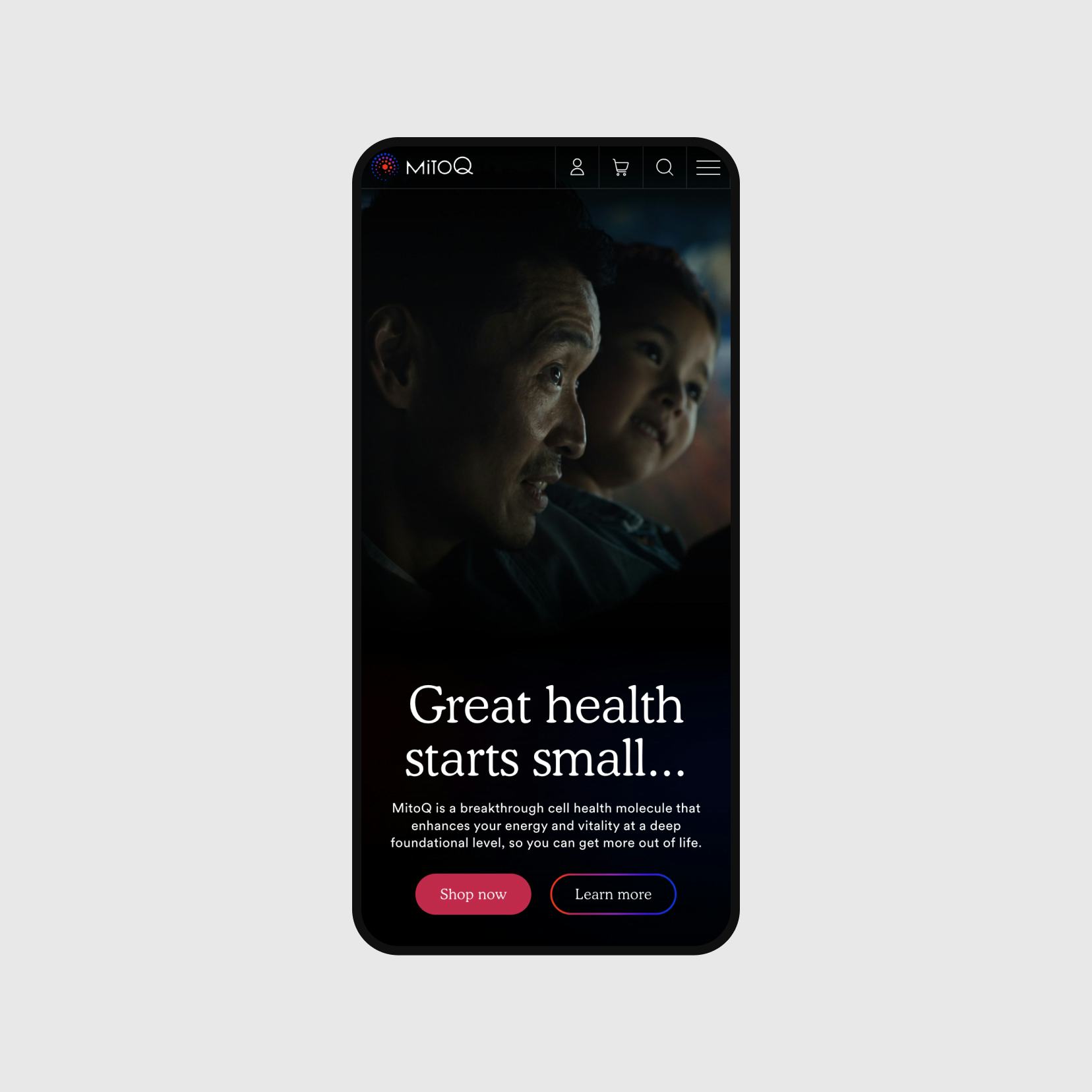
We wanted to show MitoQ woven into everyday moments, encapsulating the feeling of a daily ritual that sets you up for success.
In the photography we showed moments of connection between people and contemplative individual moments of joy or satisfaction.


Power of stories
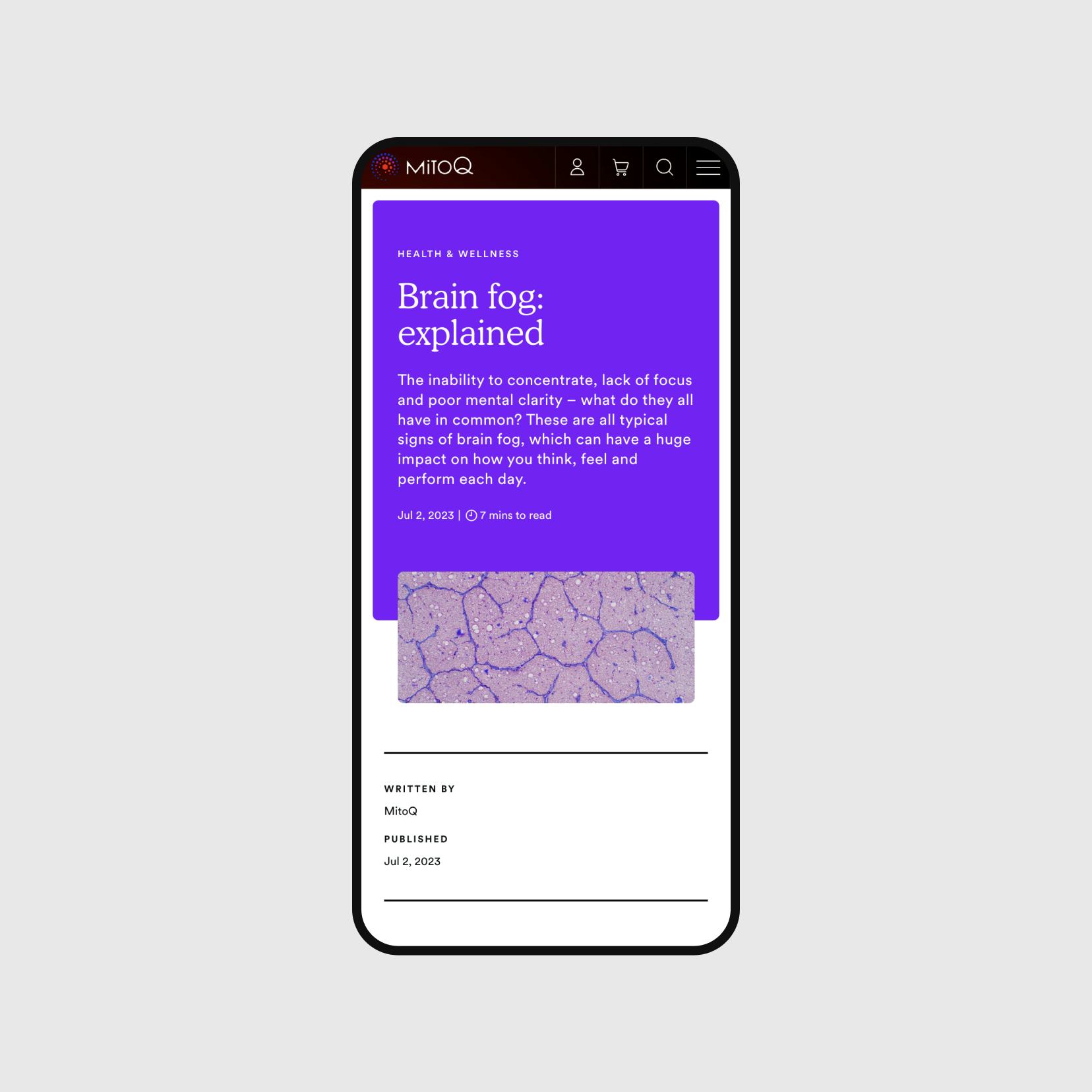
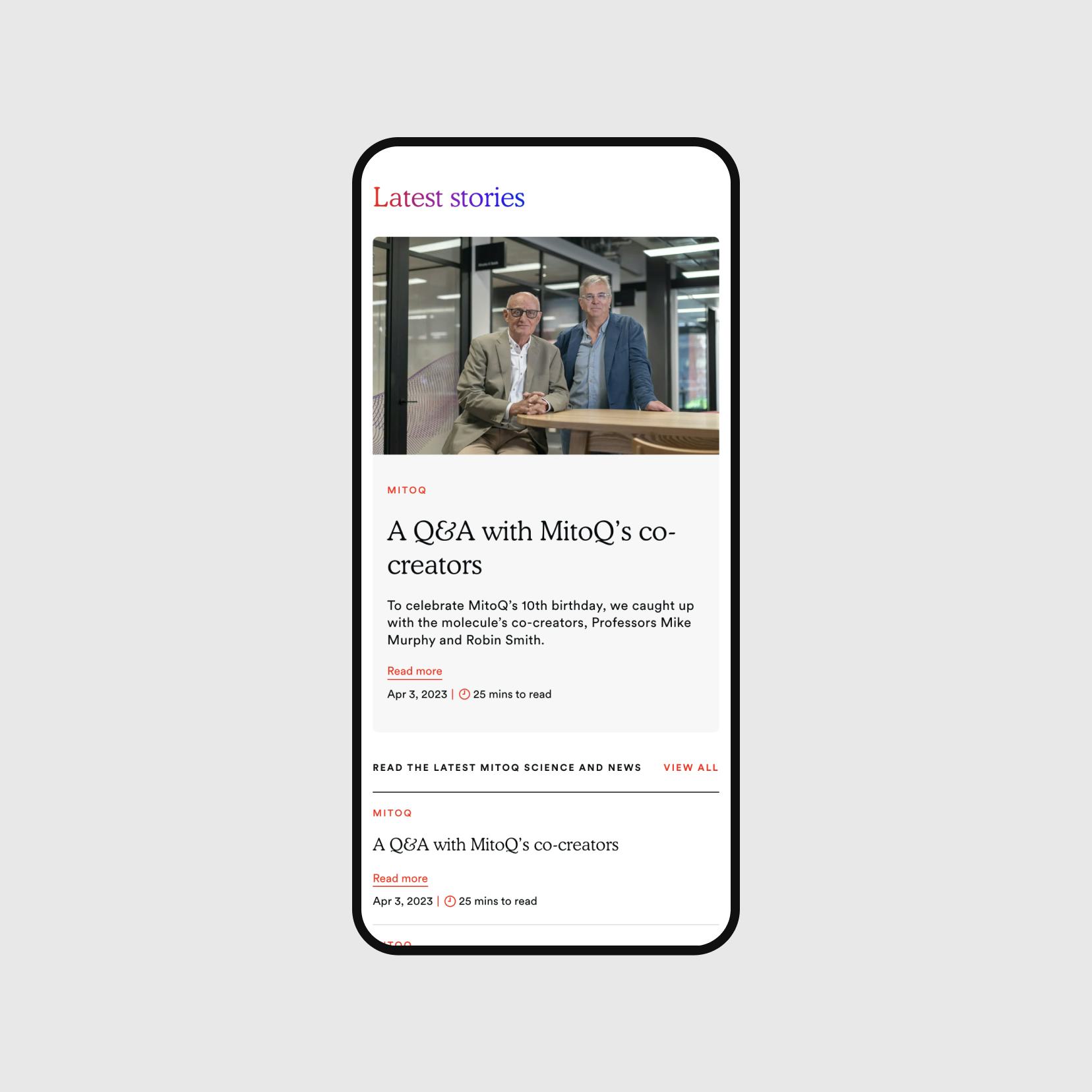
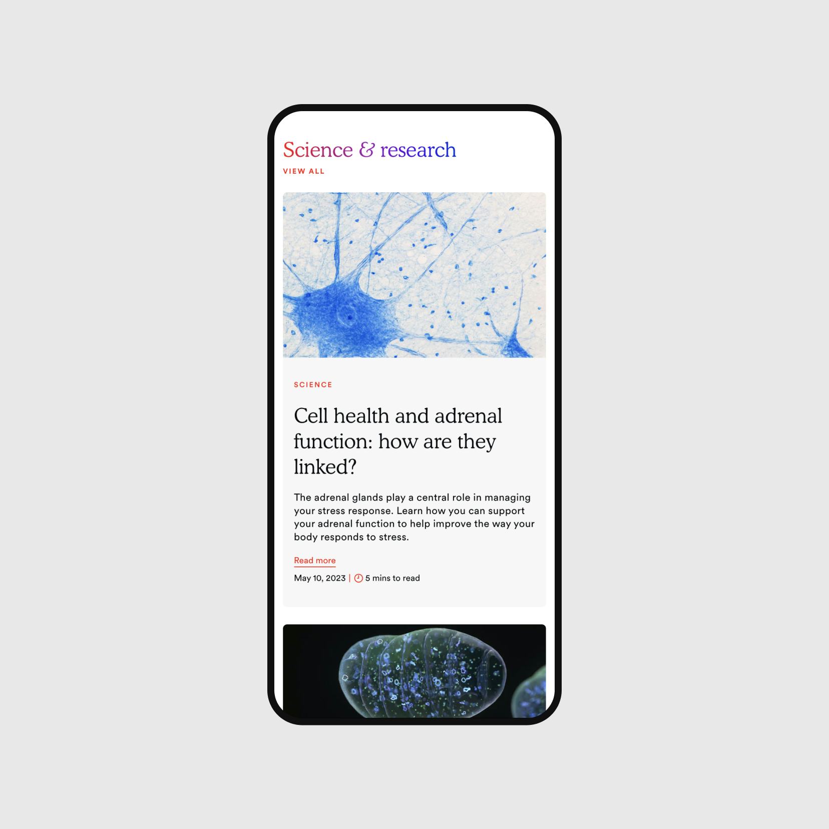
Stories of human achievement, overcoming the odds, or being present in the moment are showcased throughout the site.
A modular design-based CMS (built on Craft) lets the MitoQ team keep the site refreshed with testimonials, case studies and interviews.
The Journal section with its magazine-style layouts has become a powerful organic SEO tool for MitoQ who are highly active with articles.







Brand touch
MitoQ isn't sold in stores, so their digital presence is their flagship. They put brilliant energy into their brand, from their strategy and identity work with Born Ugly, to their sustainable packaging and product design.
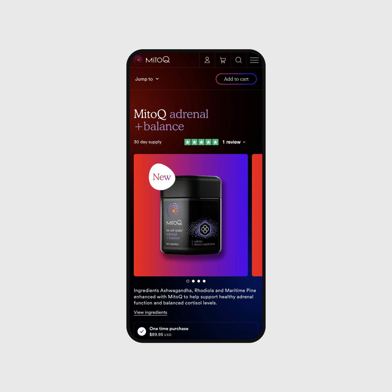
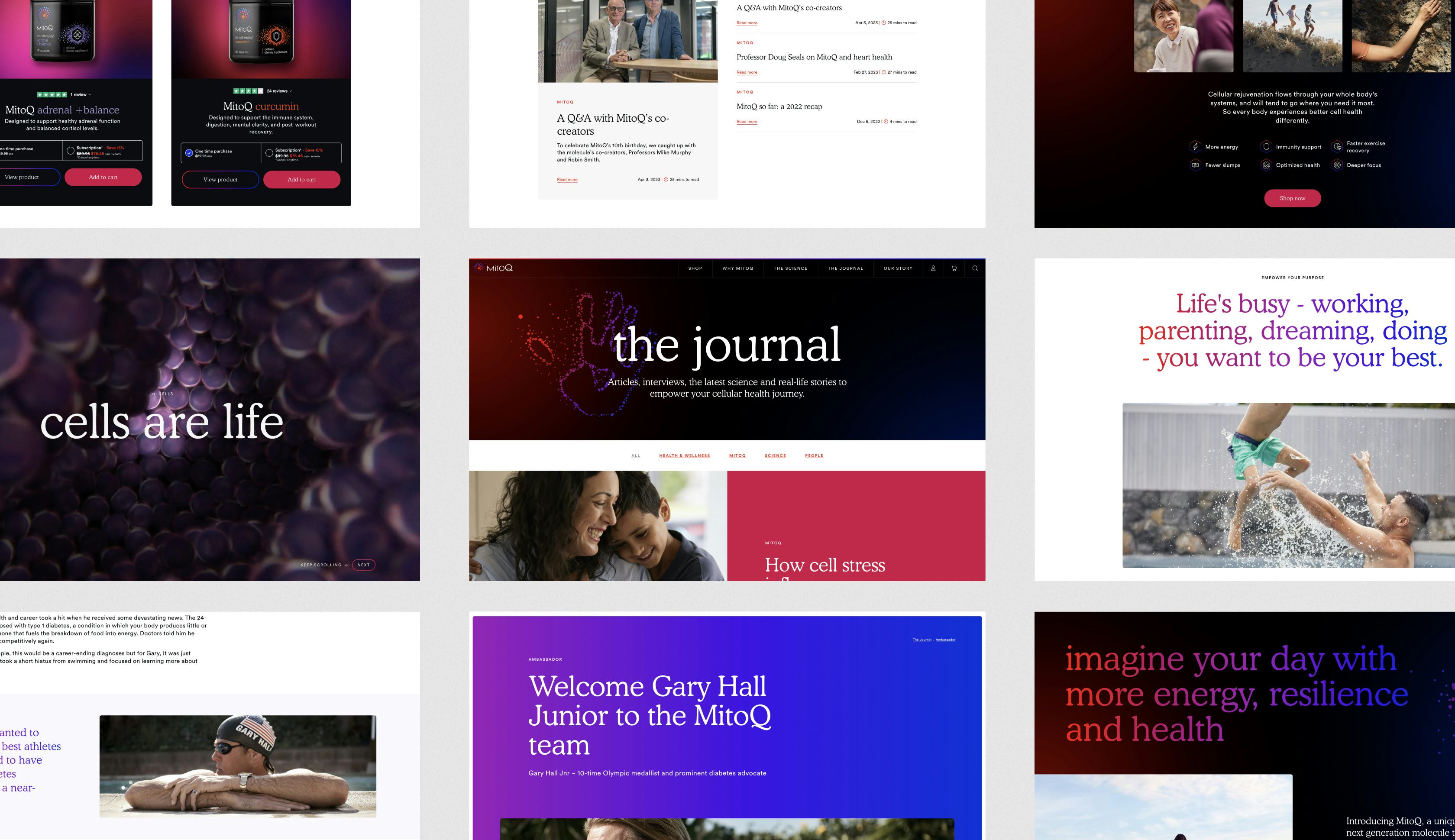
We crafted every element of the site's design, from the rich colours of the homepage video to the subtle animation of CTA buttons to reinforce their distinctive brand feeling.
Colour theory
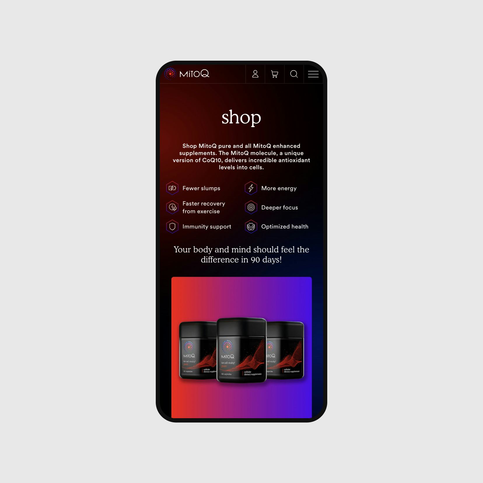
The brand identity used a language of blues and reds - where blue was the base state of your body’s cells, red was the excitement of the MitoQ molecule, and purple is the energy cascading between them.
We expressed this story in multiple moments throughout the site, from the backgrounds of key pages, where red and blue gradients slowly swirl into each other, to button rollovers, where colours radiate as you hover.

Expressing the science
The story of the science behind MitoQ and the way it works to optimise your mitochondria was complex.
By using 3D assets created by Northforge we crafted a scrollytelling experience that takes users deep inside the energy process of their own cells.
Like a more serious Pixar, bringing these cellular characters to life as beautiful objects makes the process feel as fascinating as it truly is.
Clear and trustworthy
MitoQ has a decades-long legacy of scientific credentials and successful independent trials. It was important for our design to exude trust and authority.
We wanted to present information in engaging ways, but simply and transparently.
In the copywriting on the site, we worked to achieve a tone of "approachable expert" and reduced messaging down as simply as it could be while retaining its truth.
“We have loved having you guys to partner with, and I have had so many brilliant comments about the writing on the site.”
Liz Hancock
Head of Brand Communications, MitoQ


Journey to purchase
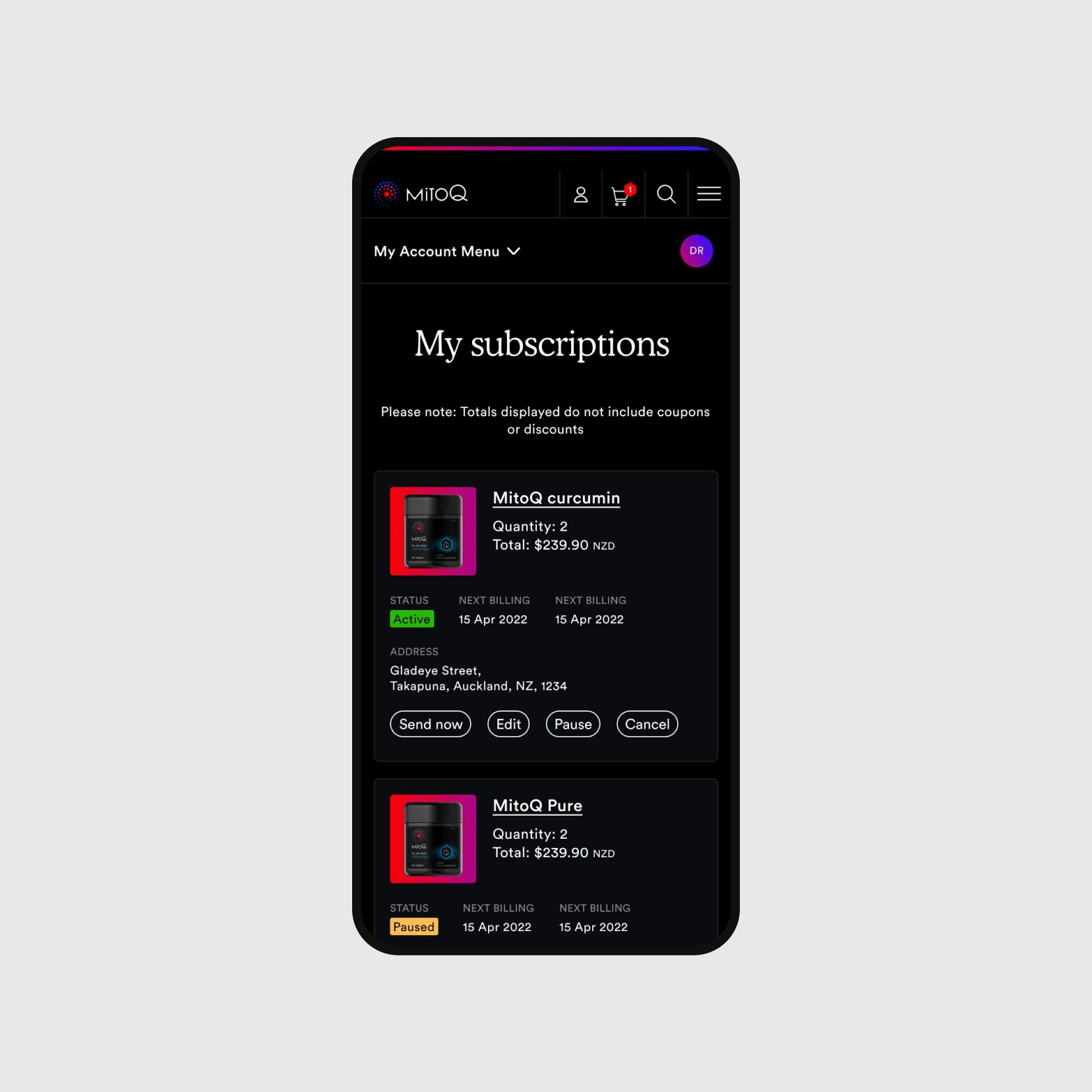
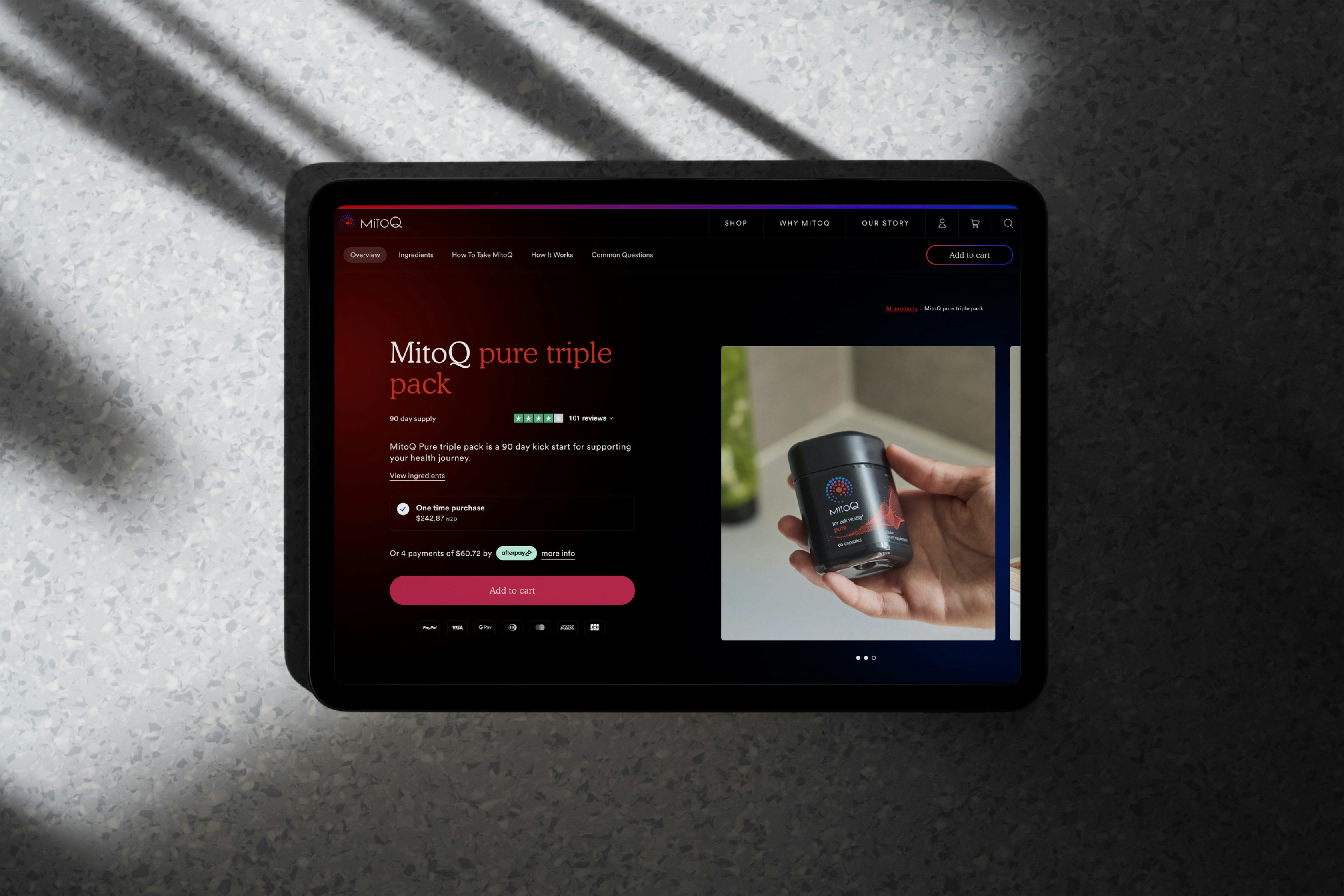
We designed an intuitive information architecture that guides visitors through their journeys of research or exploration.
With all of our CMS-driven websites there are "no dead-ends", users can continue to explore deeper and deeper. And at all times there are contextual calls-to-action.
As soon as they feel convinced or inspired - to buy, subscribe, connect - that action is instantly available.



Ripple effect
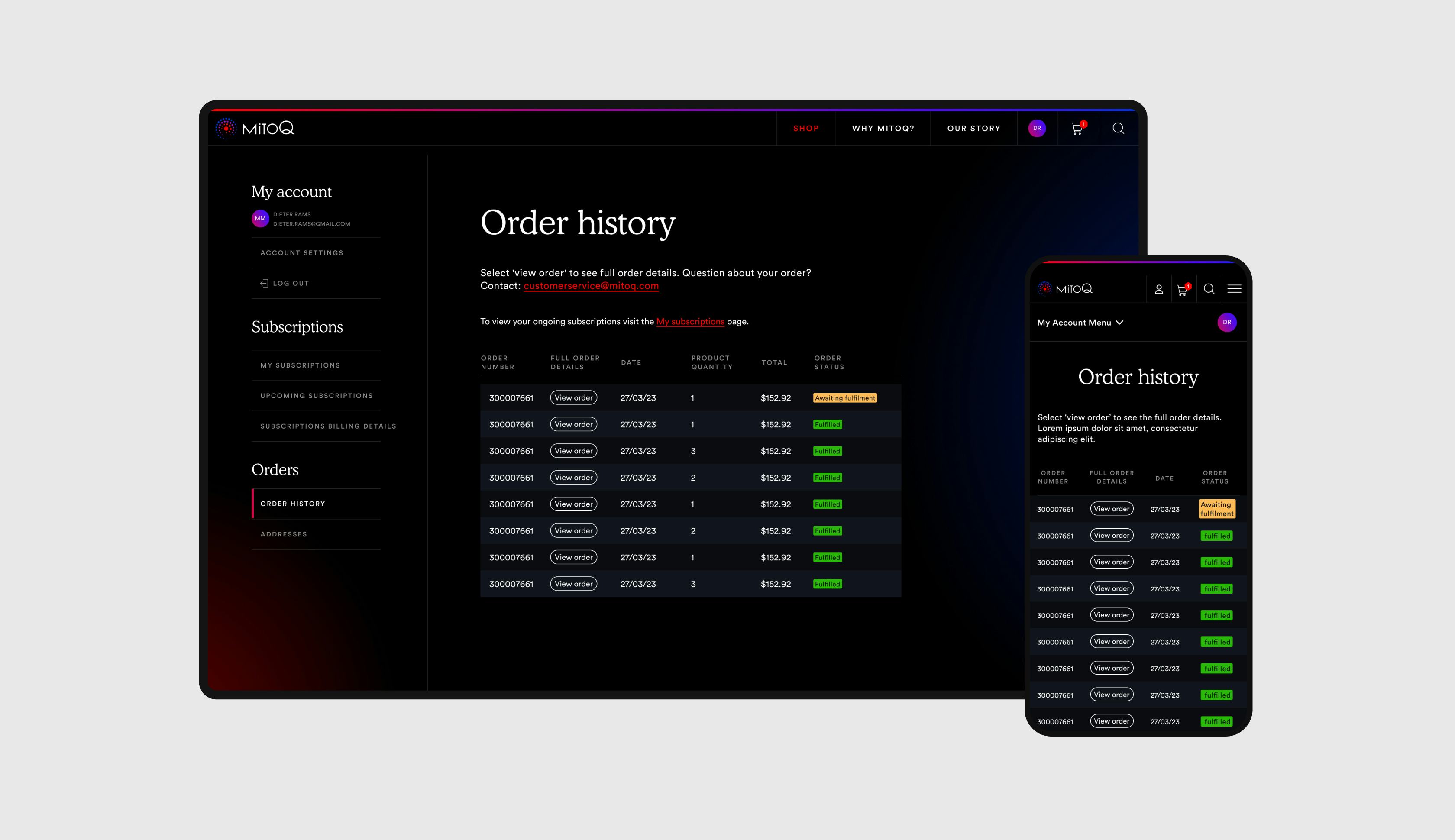
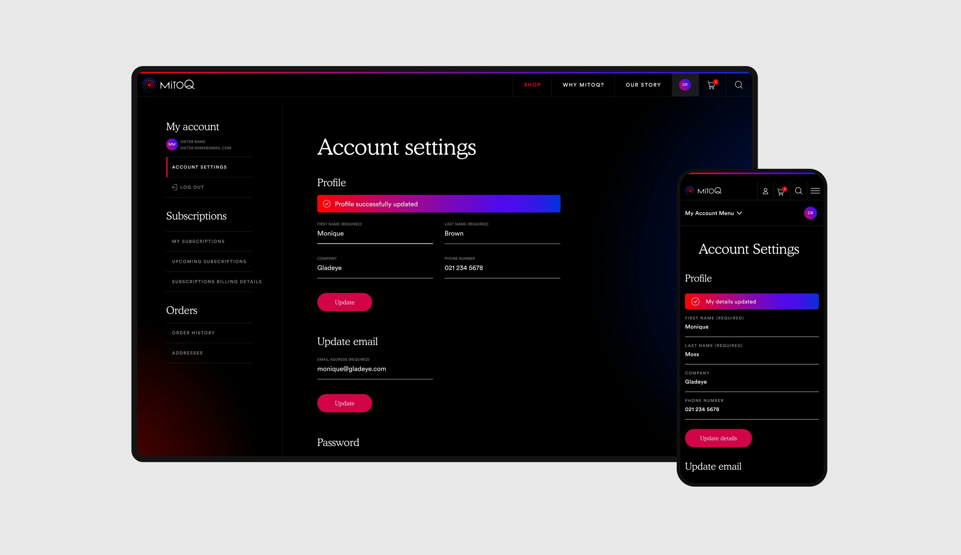
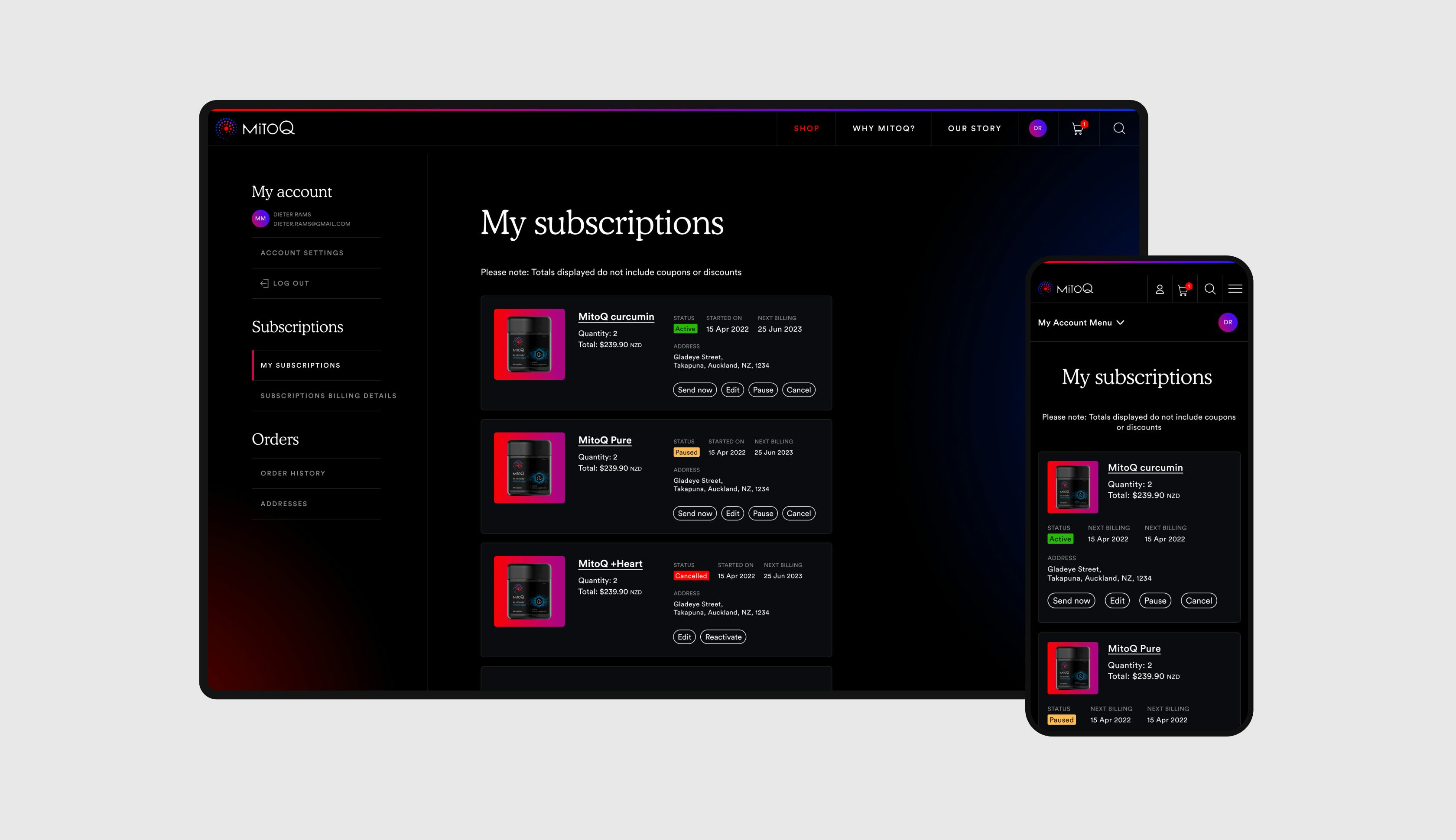
Conveying MitoQ’s story of positivity radiating outwards in a ripple effect from an individual's focus on their health - to their family, friends, colleagues and the world around them was our aim.
We wanted the website to express this positively charged feeling in the way it looks and moves. And create a smoothly usable ecommerce experience that has storytelling at its heart.