Orcon - Website
Be unstoppable in your digital life with Orcon
Orcon is known as New Zealand's original digital disruptor but their web presence had become outmoded and competitors were taking that space.
Customer research and a striking new brand identity led us to reimagine the modern ISP website - blending conversational UX flows with aspirational imagery.
Out with the old
Orcon wanted a new website that would shatter perceptions around ‘dull’ ISP websites and truly embody their brand proposition - powering the creativity that drives New Zealand forwards.
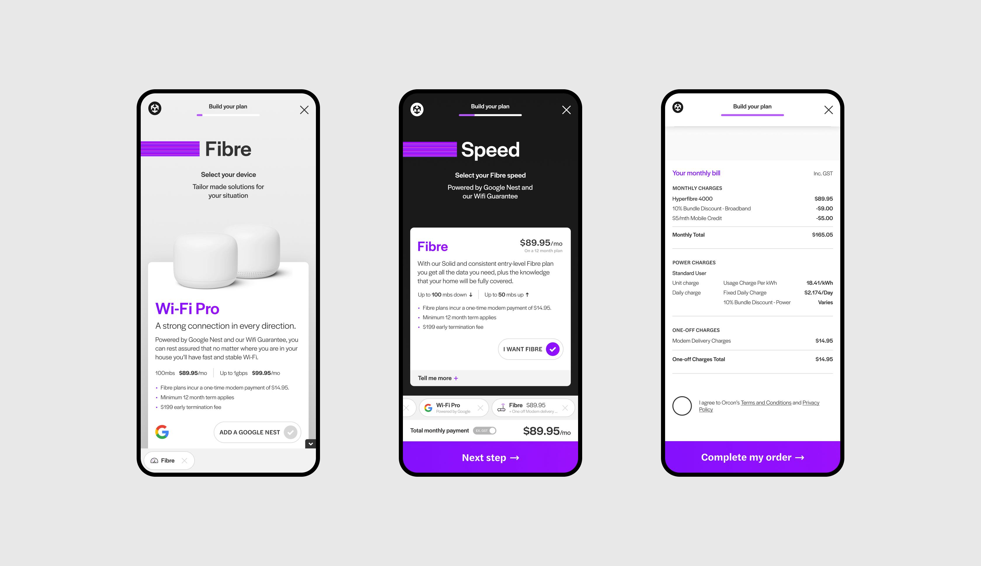
A critical challenge of this new website would be to rethink the new customer sign-up flow to strip out the obstacles and create a seamless process that matches the quality of Orcon’s products.


The Apple factor
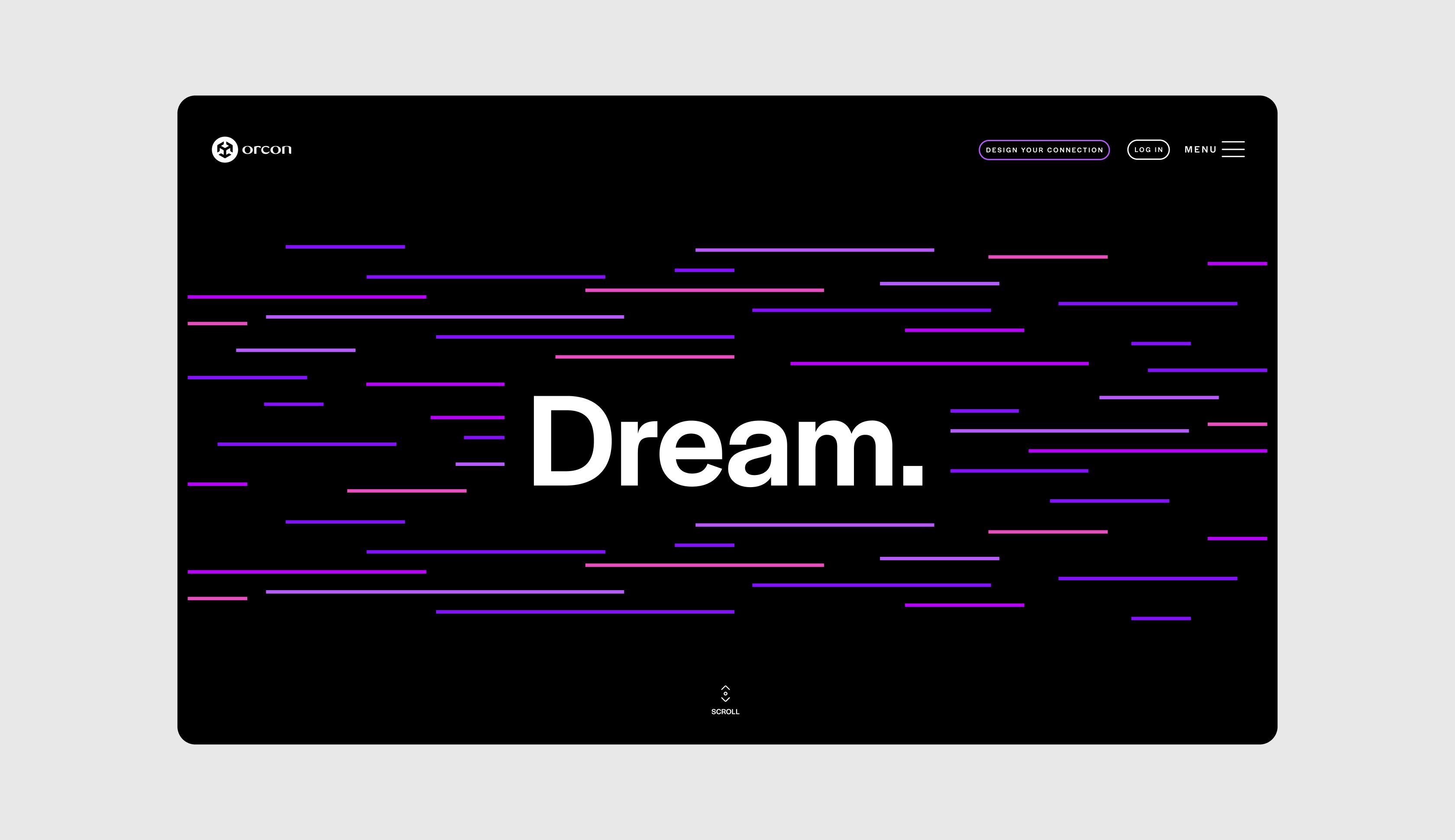
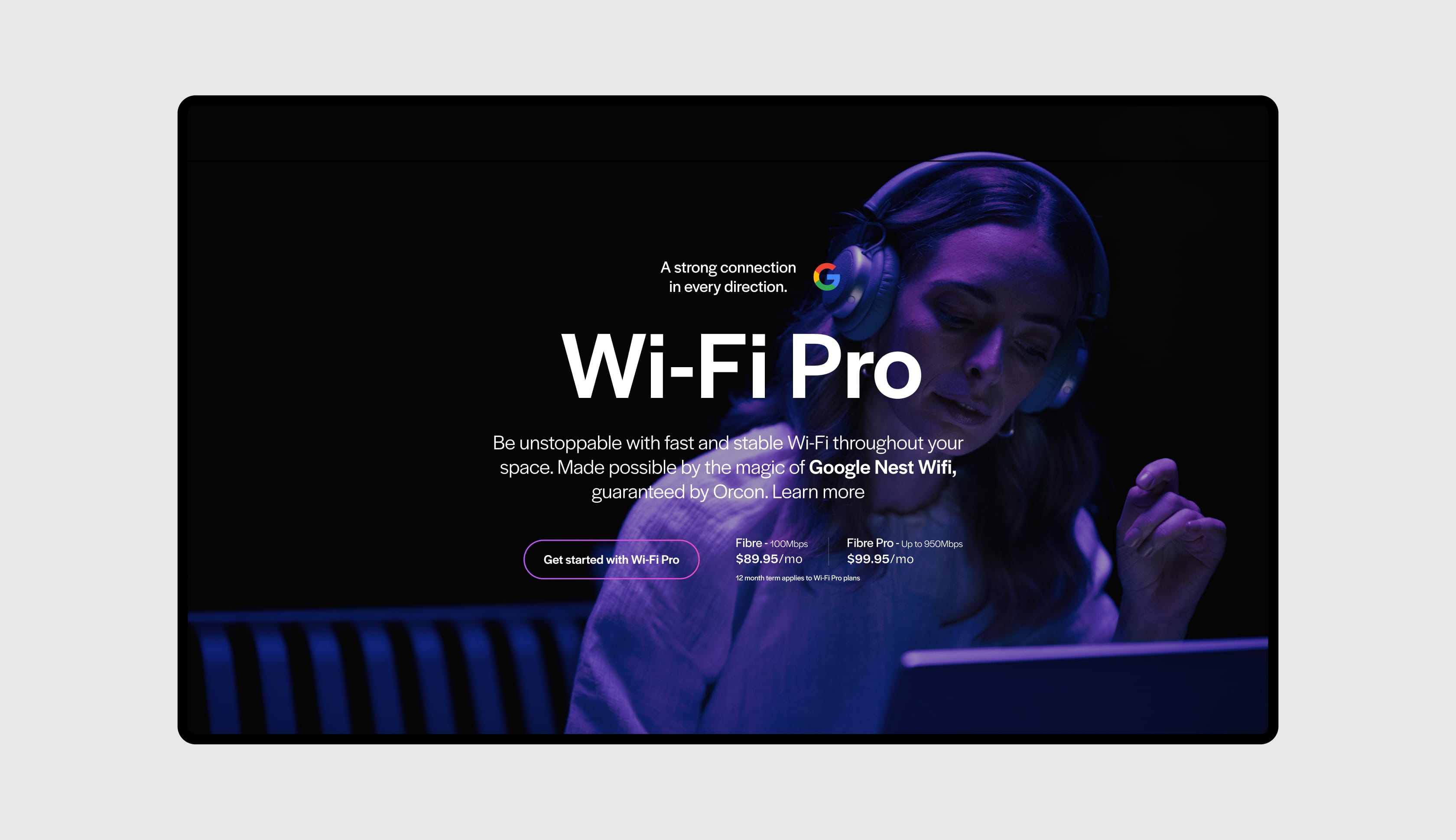
Taking cues from premium digital retailers, the homepage instantly springs to life with movement, interactivity and a sense of infinite possibilities. By choosing to lead with brand keywords: Dream, Design, Innovate, the site immediately signals an intention to feel bold and exciting.
Brand energy
The sleek new identity from VLMY&R put Orcon in the zeitgeist of New Zealand companies taking on the globe.
We translated it into a sense of horizontal speed - animations flow onto the screen, transitions swoop across it. There is a neon energy to the colour palette as purples and pinks burst out of the darkness.
Dialling up the visuals
Visual elements saturated in purples and pinks are woven throughout the website and wider campaign, showcasing the cool creators and innovator at the heart of Orcon’s audience.


Meet the prosumer
Orcon’s brand promise is the merging of business and consumer life online. A prosumer vibe.
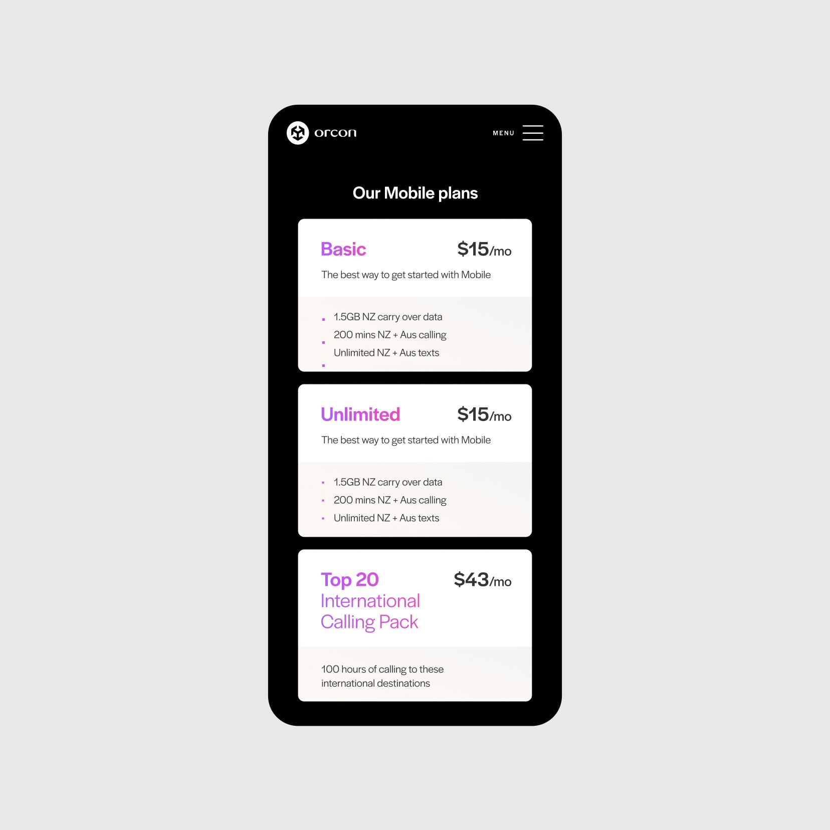
Every prosumer lifestyle is unique, so allowing people to completely customise connection speeds, account features and support plans became an essential requirement for launch.

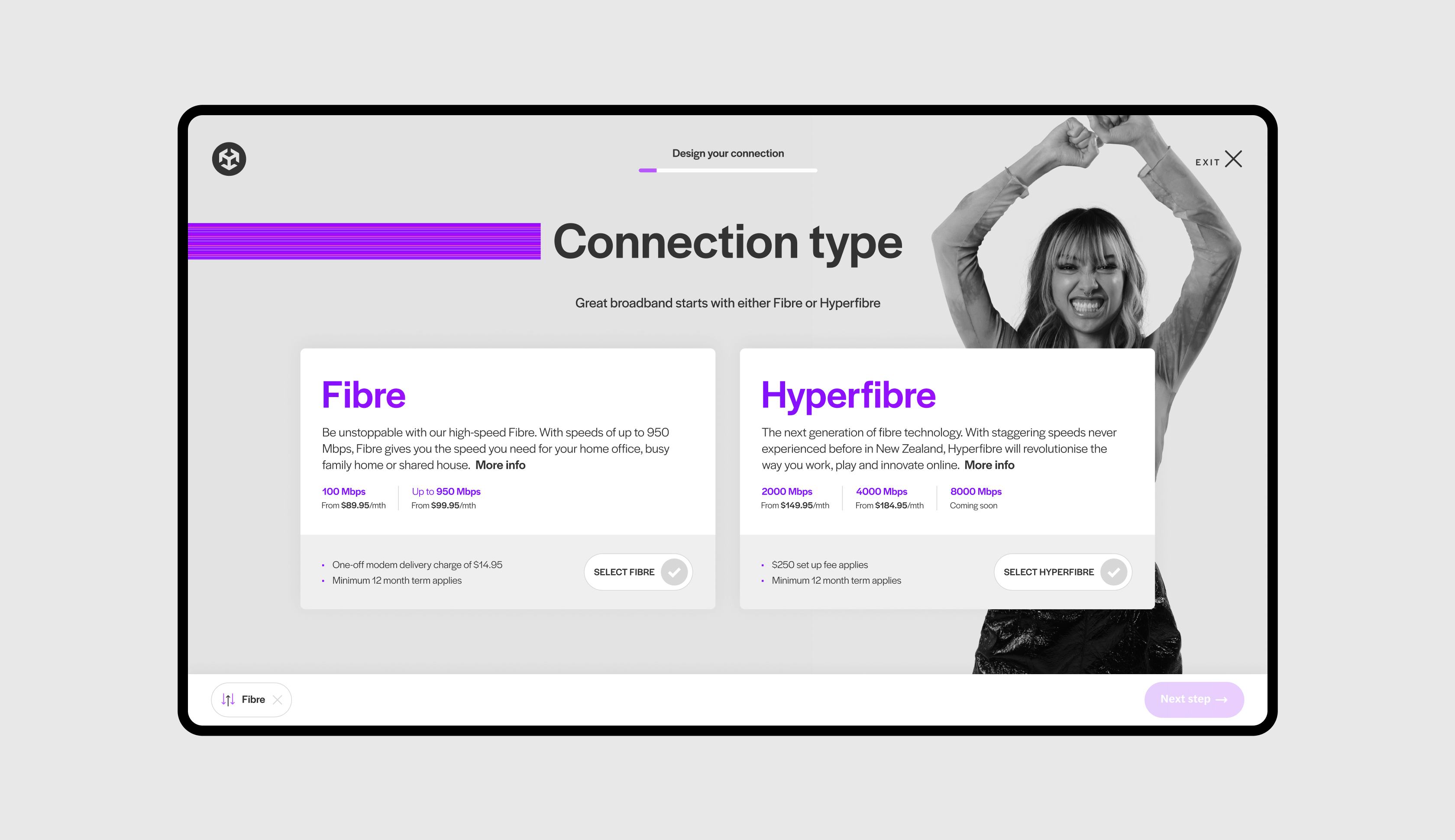
Complex to simple
Working closely with Orcon's engineering and business analysis teams we reworked their customer sign-up flow to strip out redundancies and move complexity behind-the-scenes (where it belongs).
The new dynamic sign-up puts the customer at the heart of the journey giving them flexibility and control while suggesting personalised offerings.