
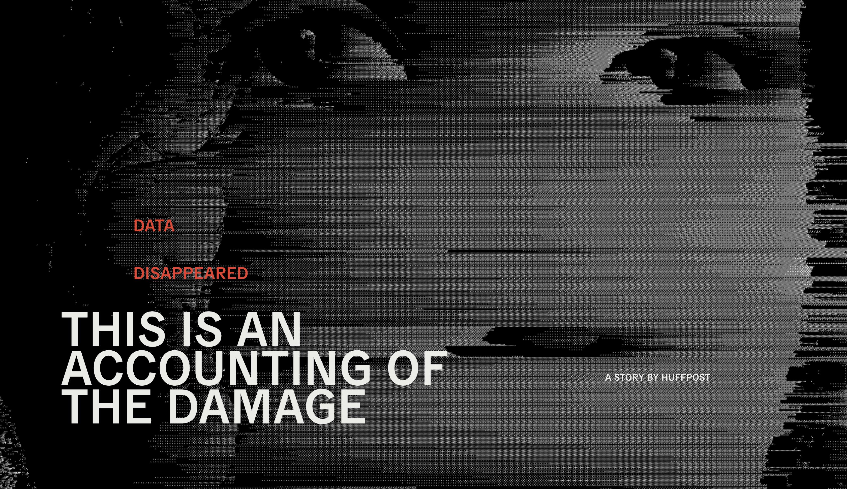
Data Disappeared
The systematic destruction of data by the US government
HuffPost worked alongside ProPublica to unearth a true picture of the damage the Trump administration did to data collection.
Across climate change, the pandemic, poverty, science, food policy, and even the census; that government cut a deliberate swathe — converting, concealing, and abandoning data.
Chaos + confusion
In the leadup to the 2020 US Elections HuffPost's goal was to engage their audience on this topic, getting them reading and sharing. They wanted to show how the manipulation of information disrupts public understanding and discussion around key issues.
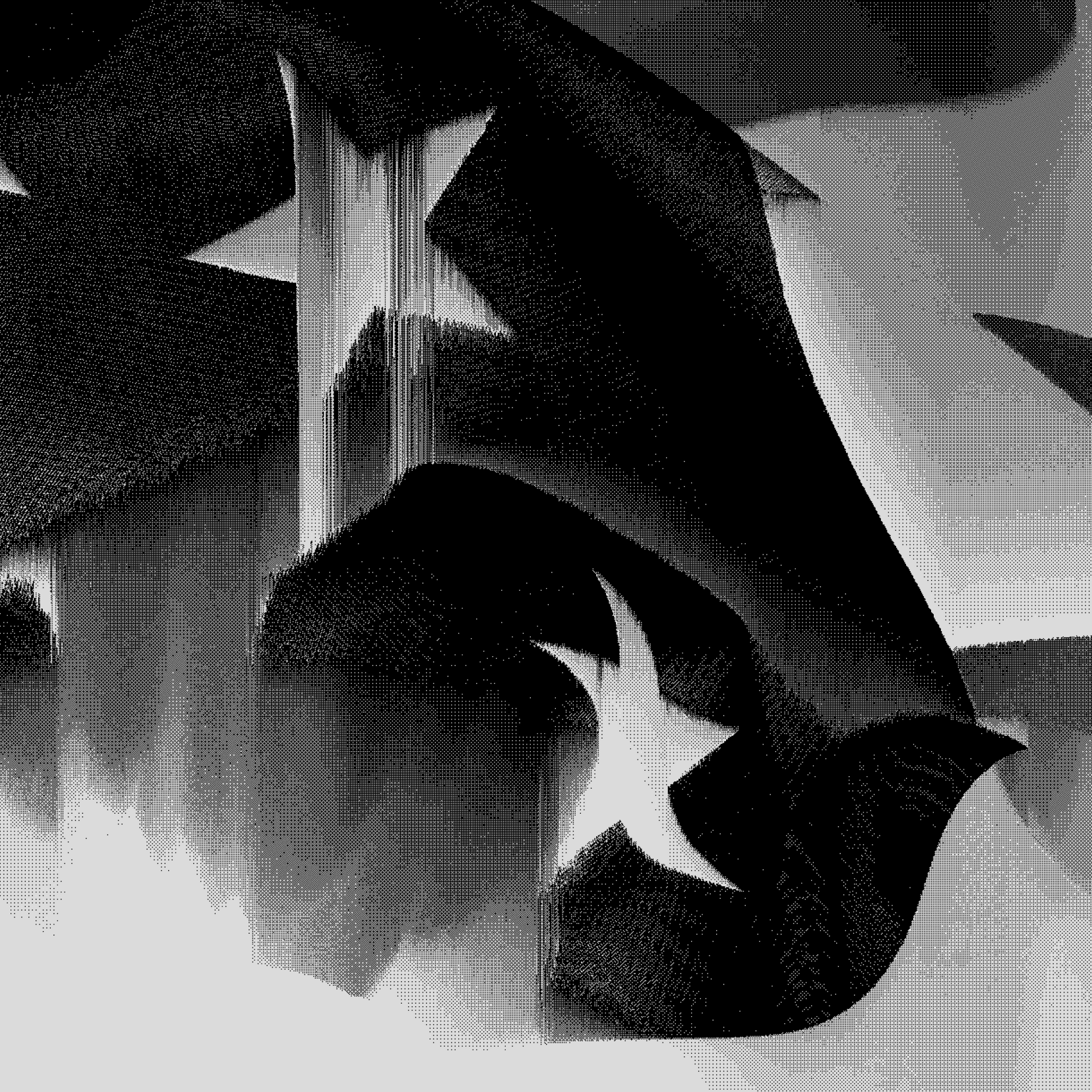
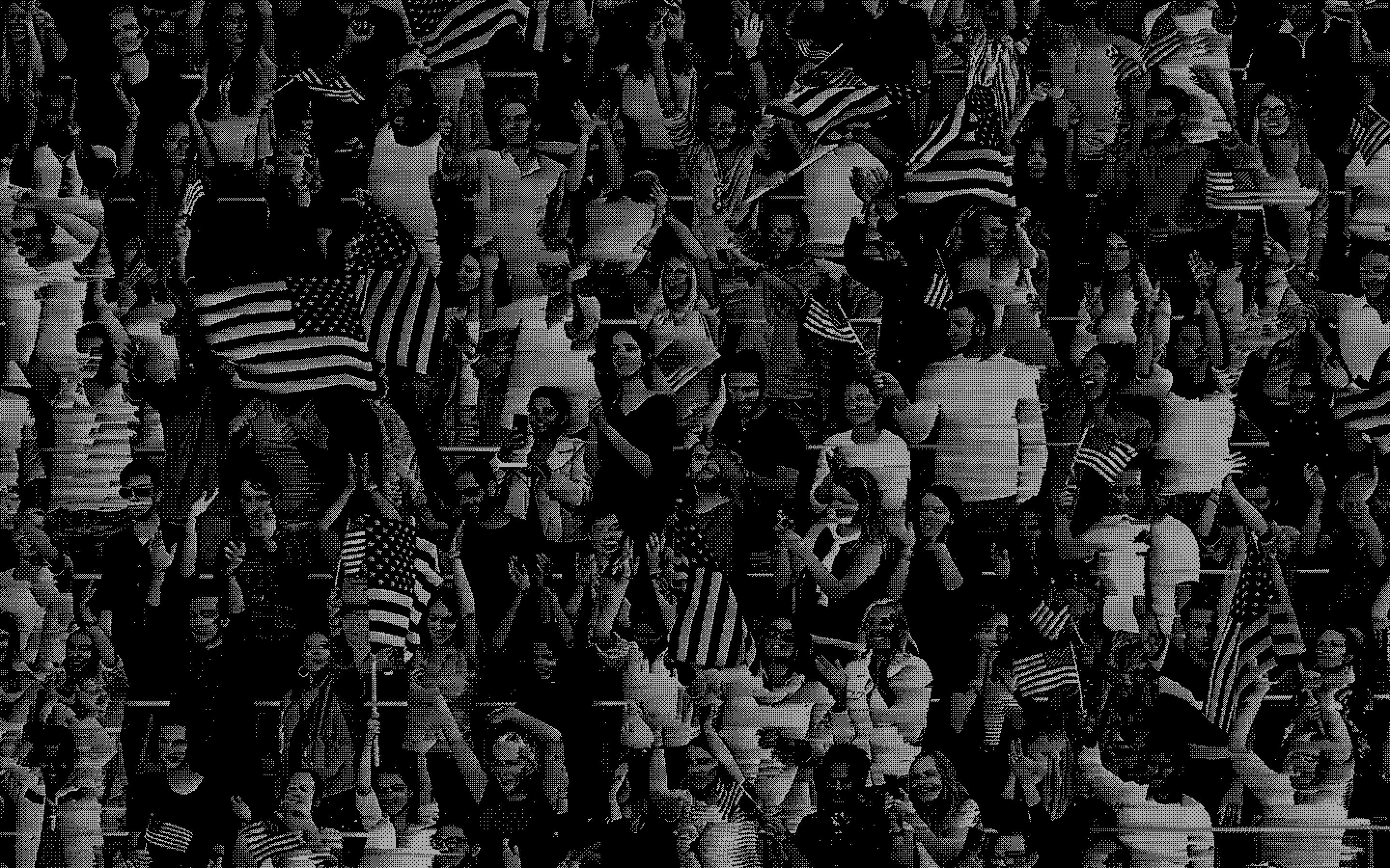
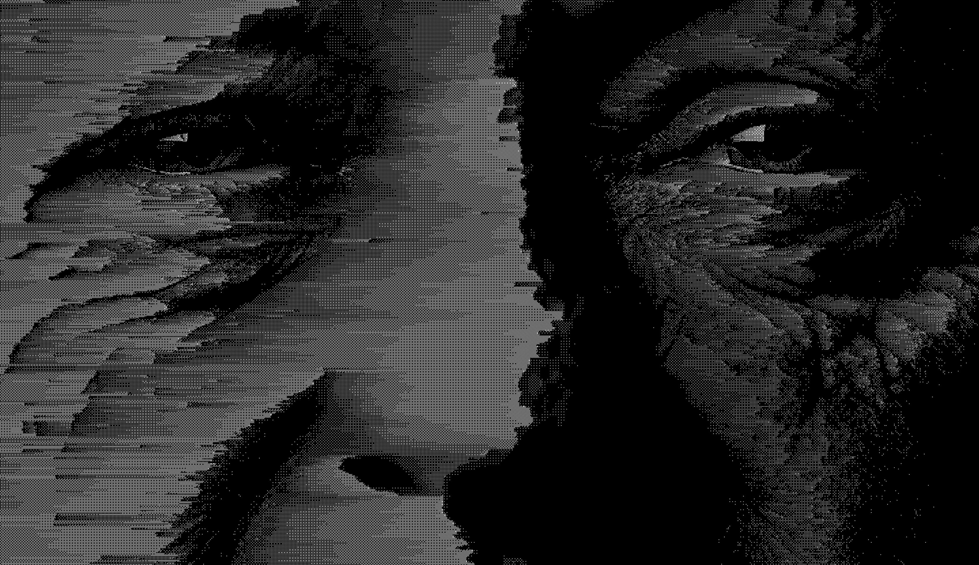
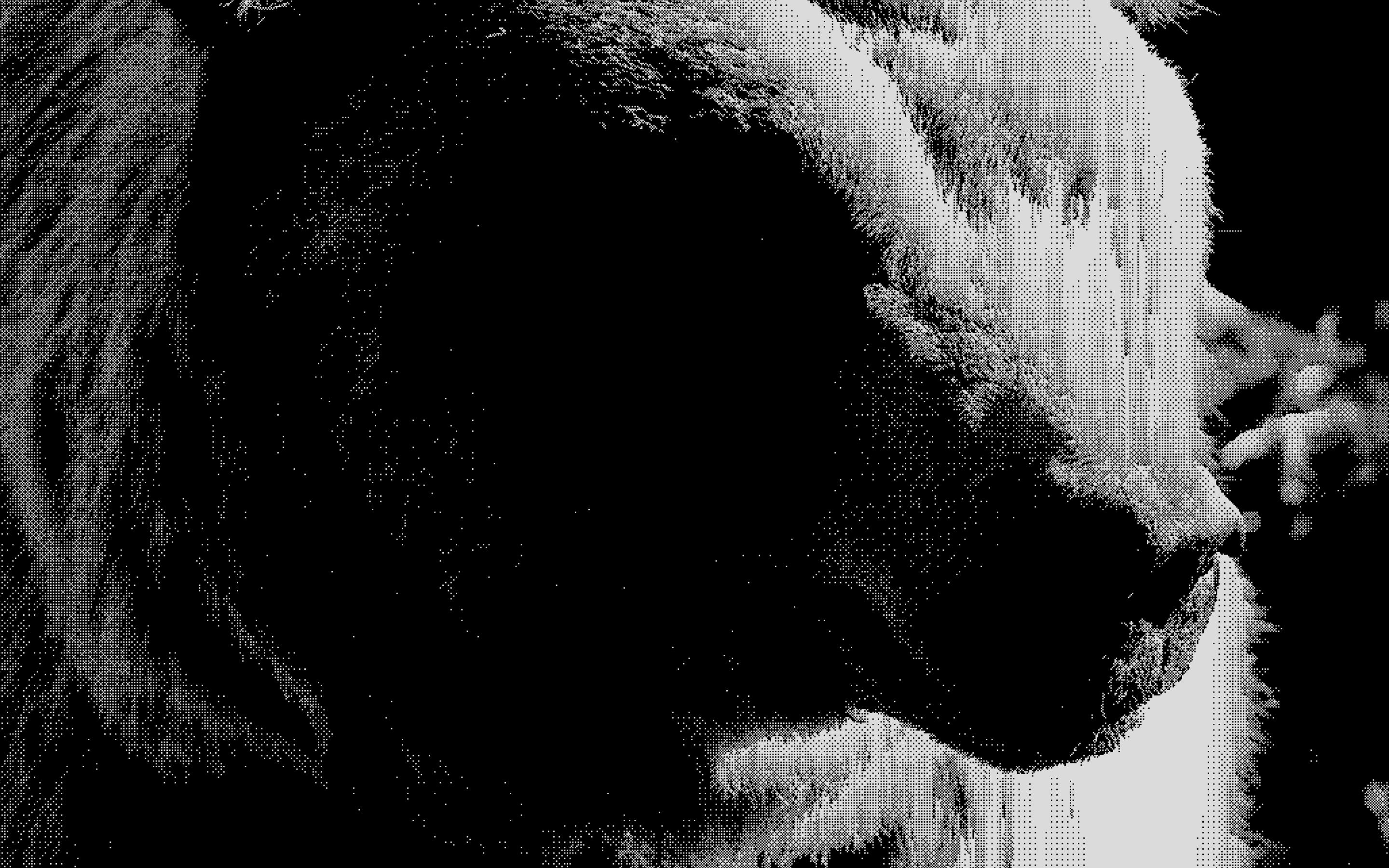
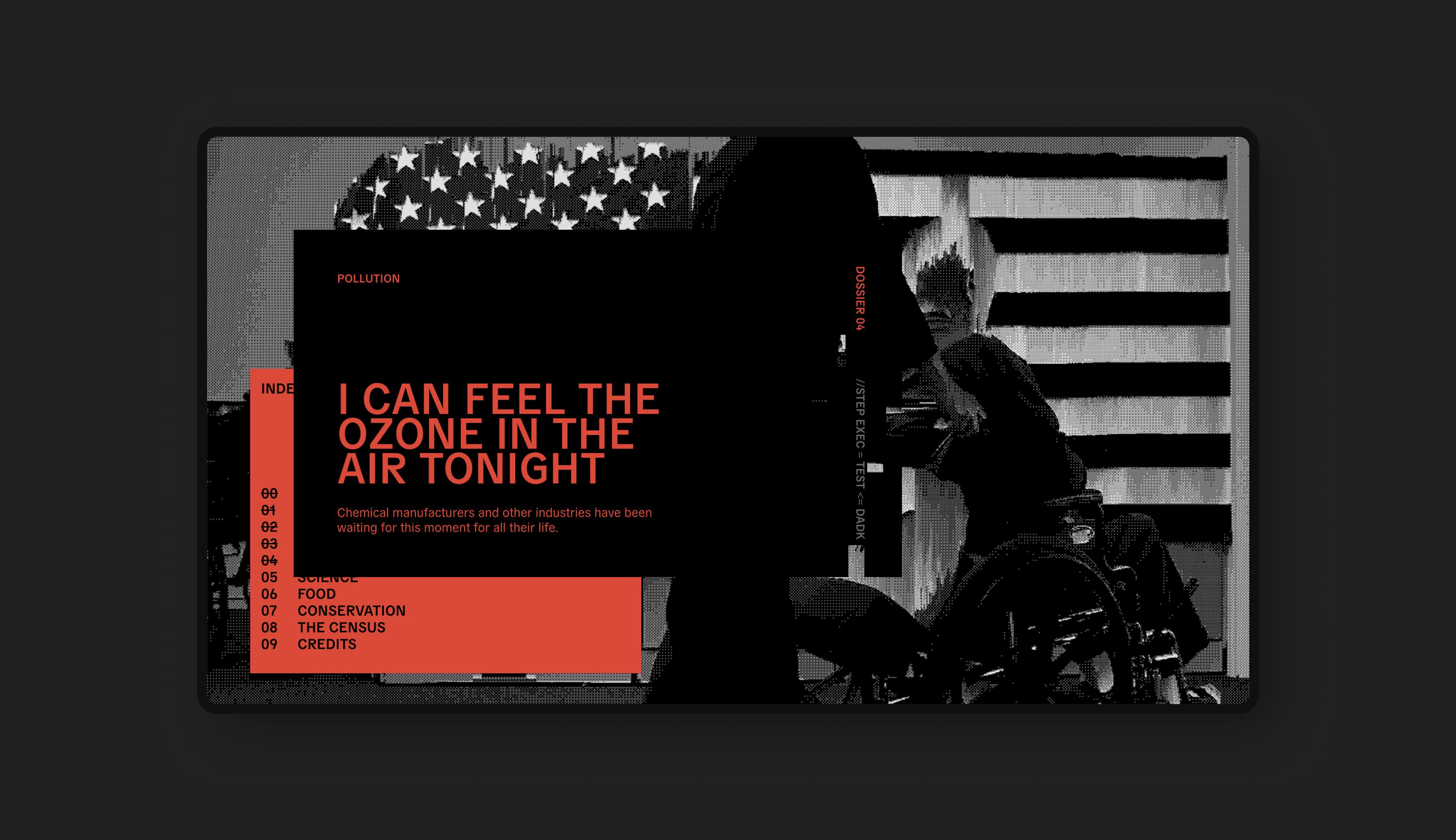
In our creative direction we wanted to convey a feeling of degradation and erosion, of data being literally eaten away as you read the article.

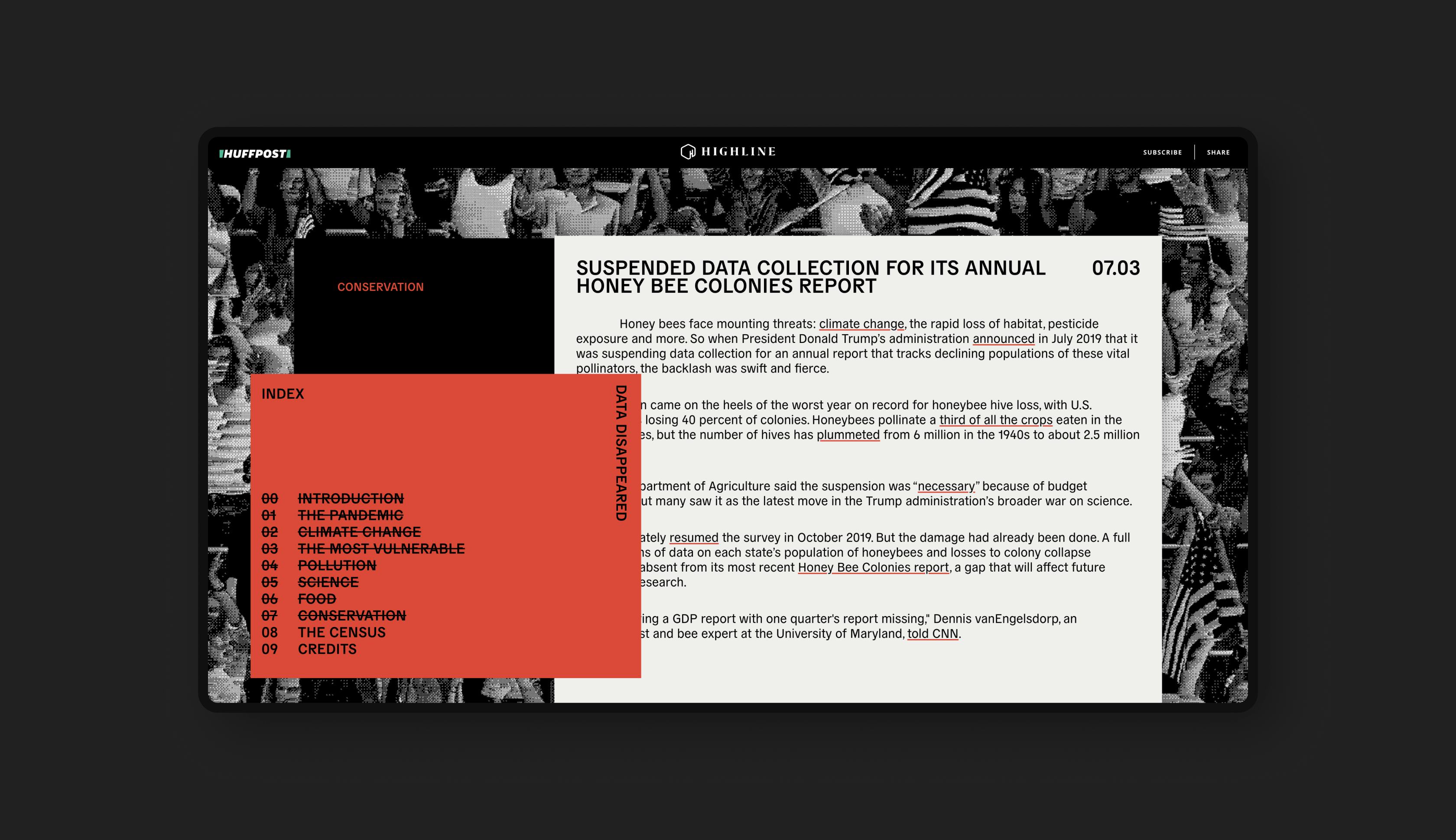
Enhanced text
This piece was designed to be text-based, without the need for photography, infographics, or video. The data would form both the content and the visual look of the article.
We devised two main ideas behind the look and feel of Data Disappeared… ‘Visual Information Decay’ and ‘Outdated Technology’. Both of these creative territories helped guide our art direction.


Data manipulation
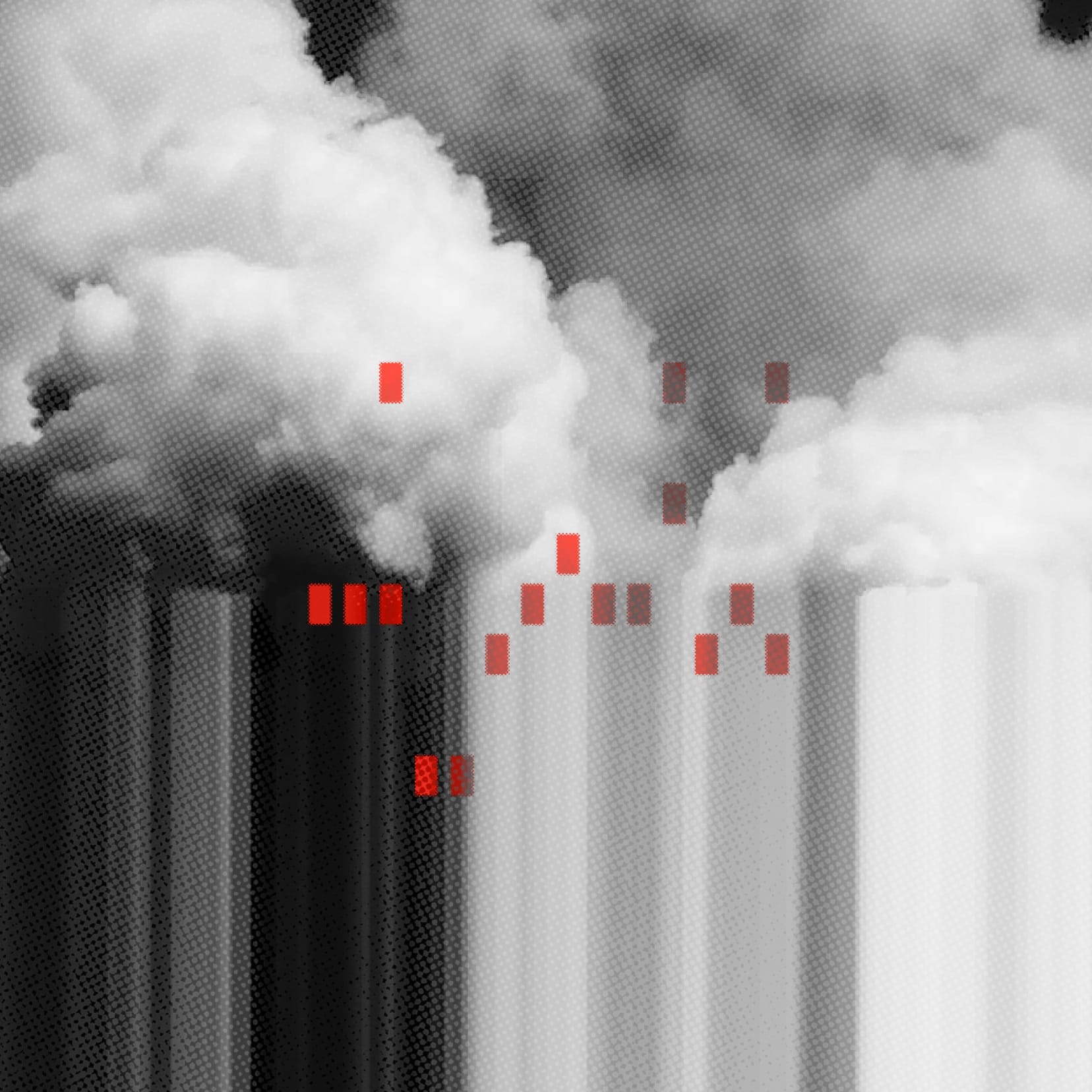
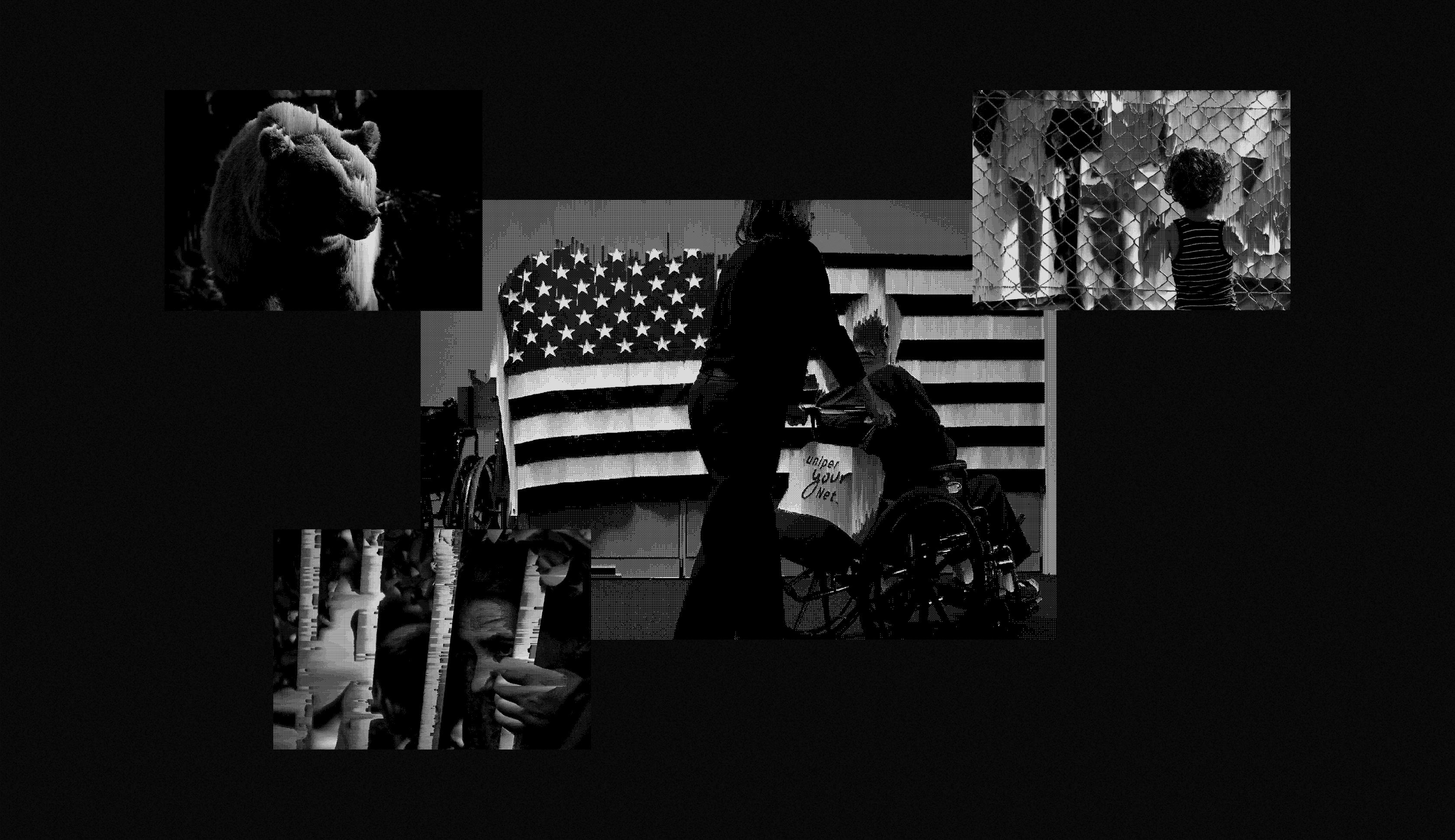
The visual backgrounds we used for atmosphere are images which have been destroyed and distorted. We used techniques to randomly strip data from the image files and they became a literal representation of the subject.
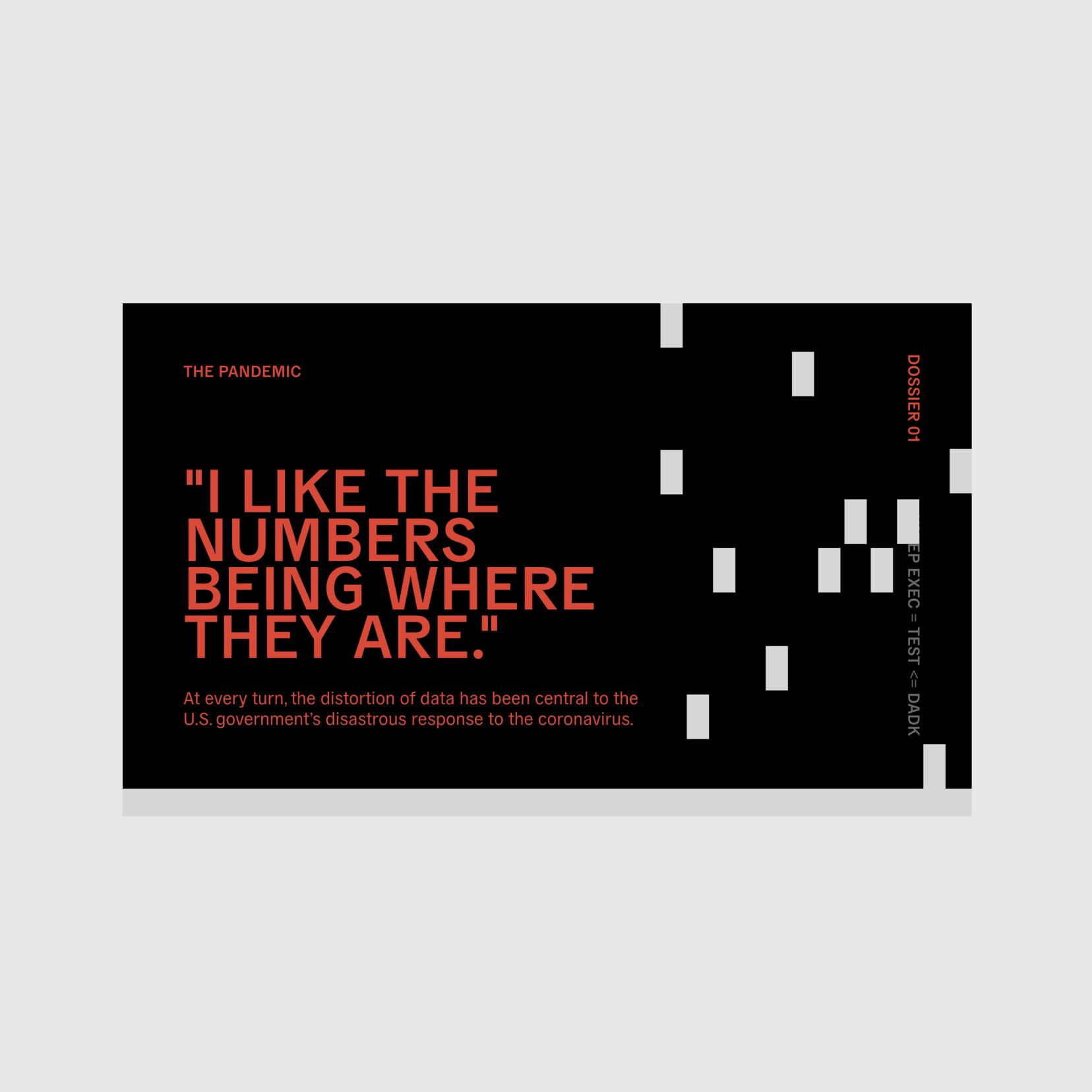
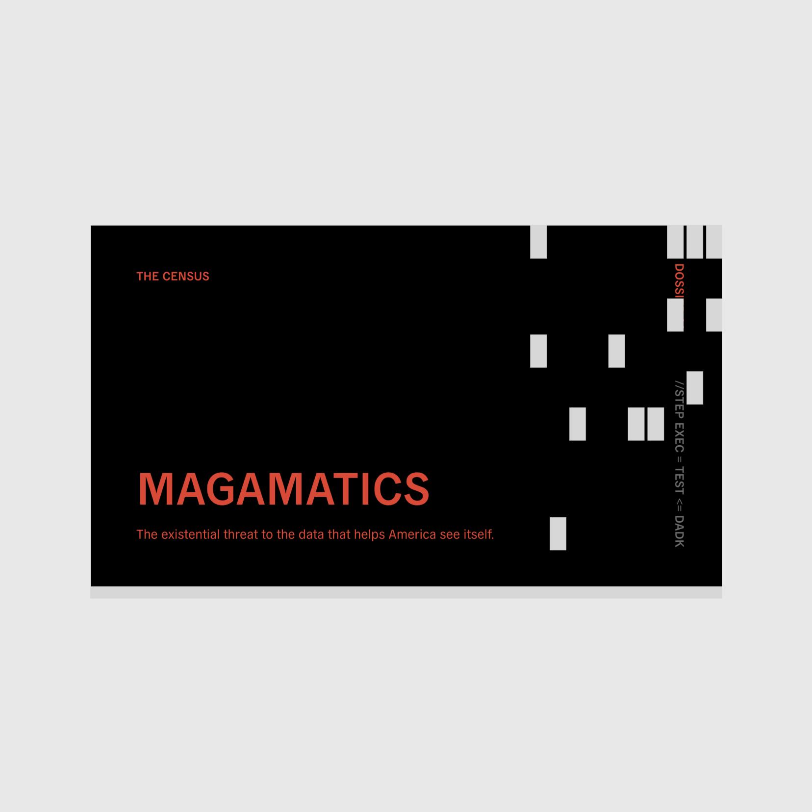
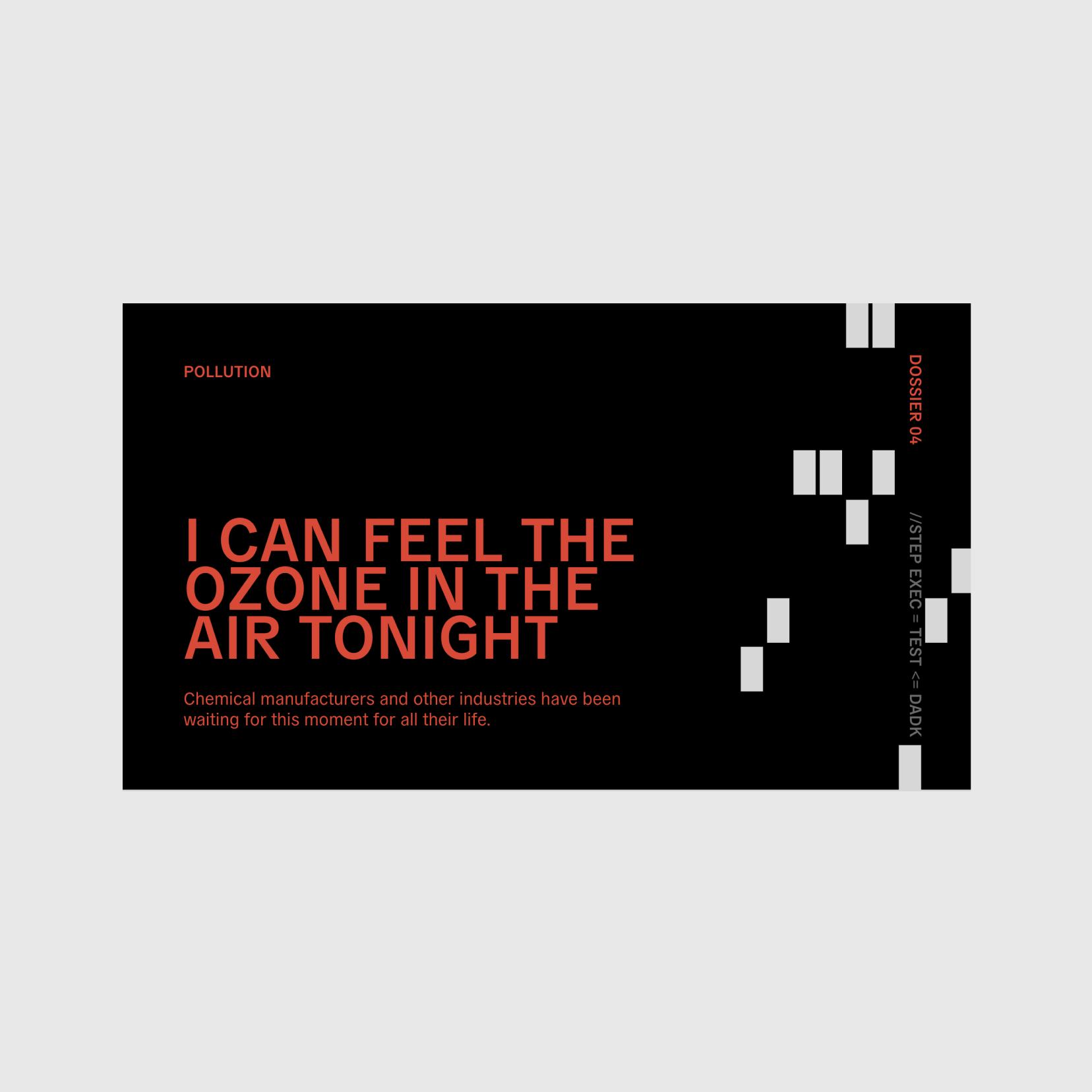
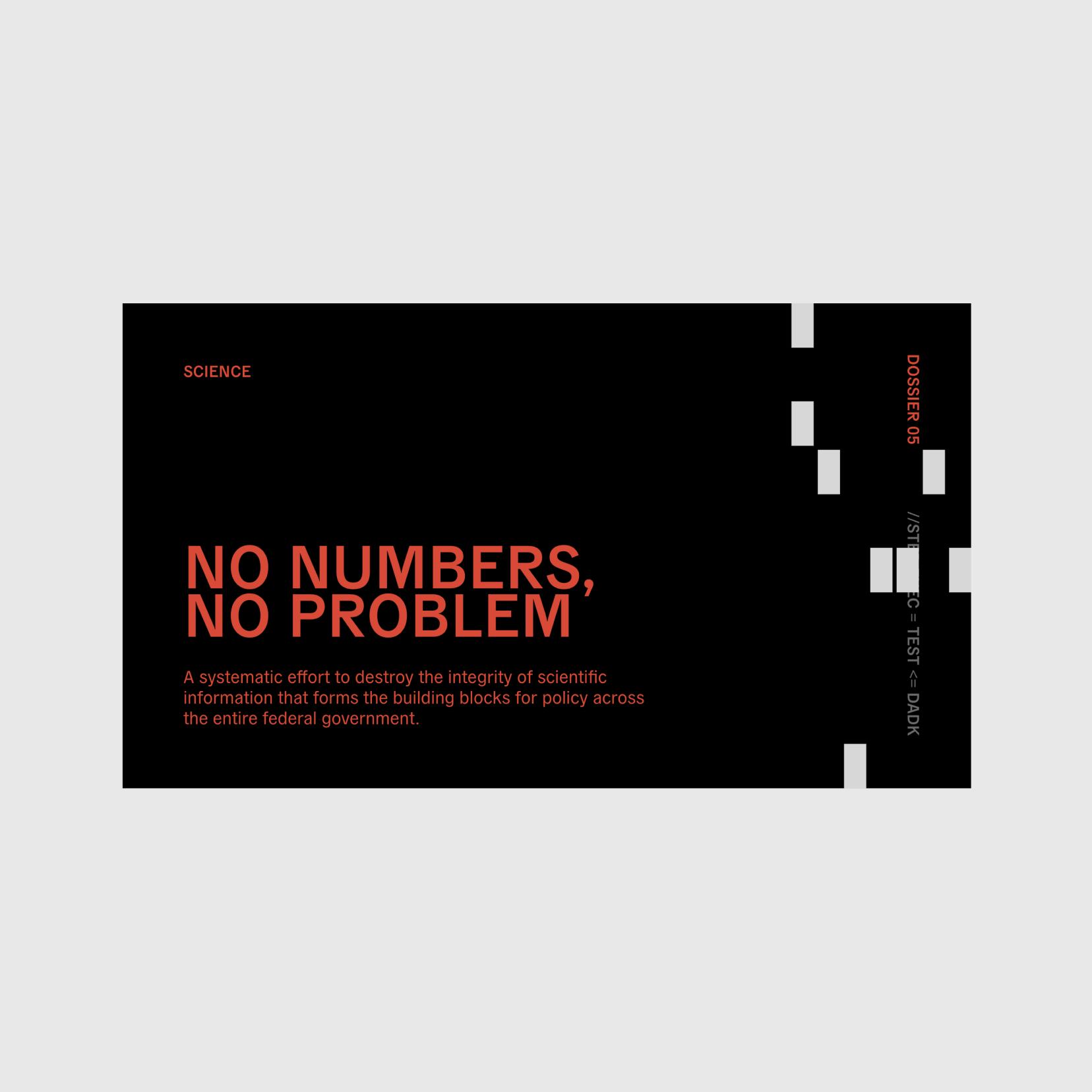
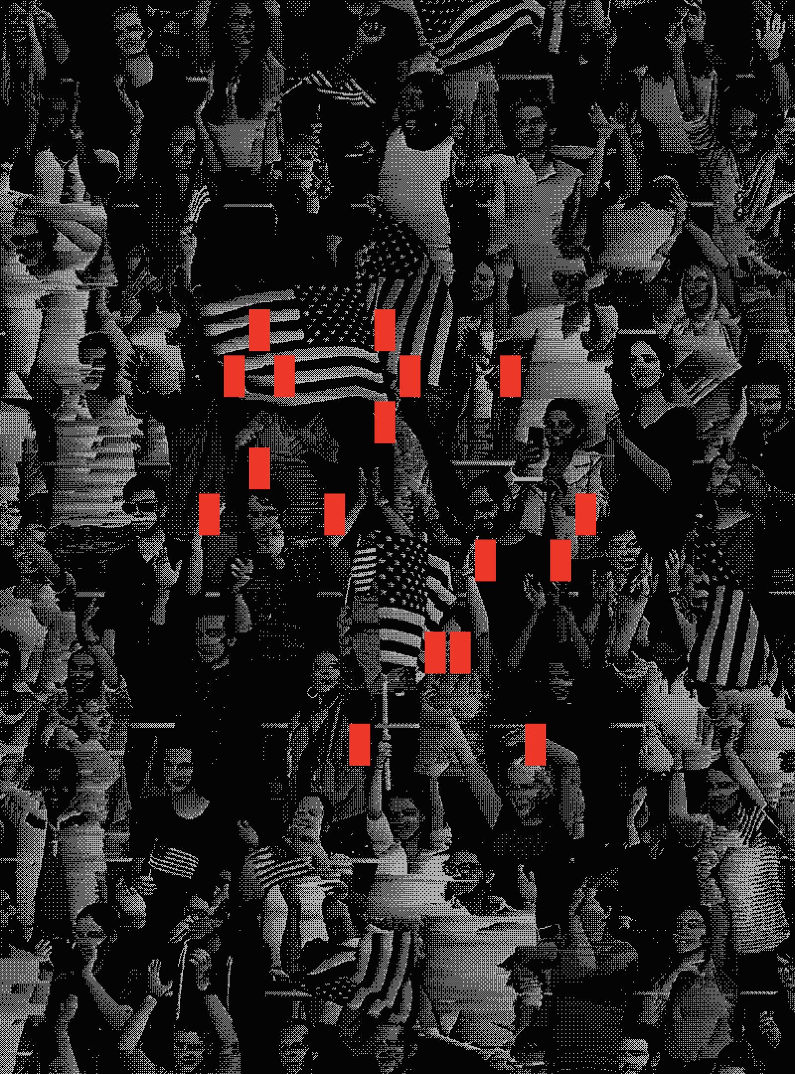
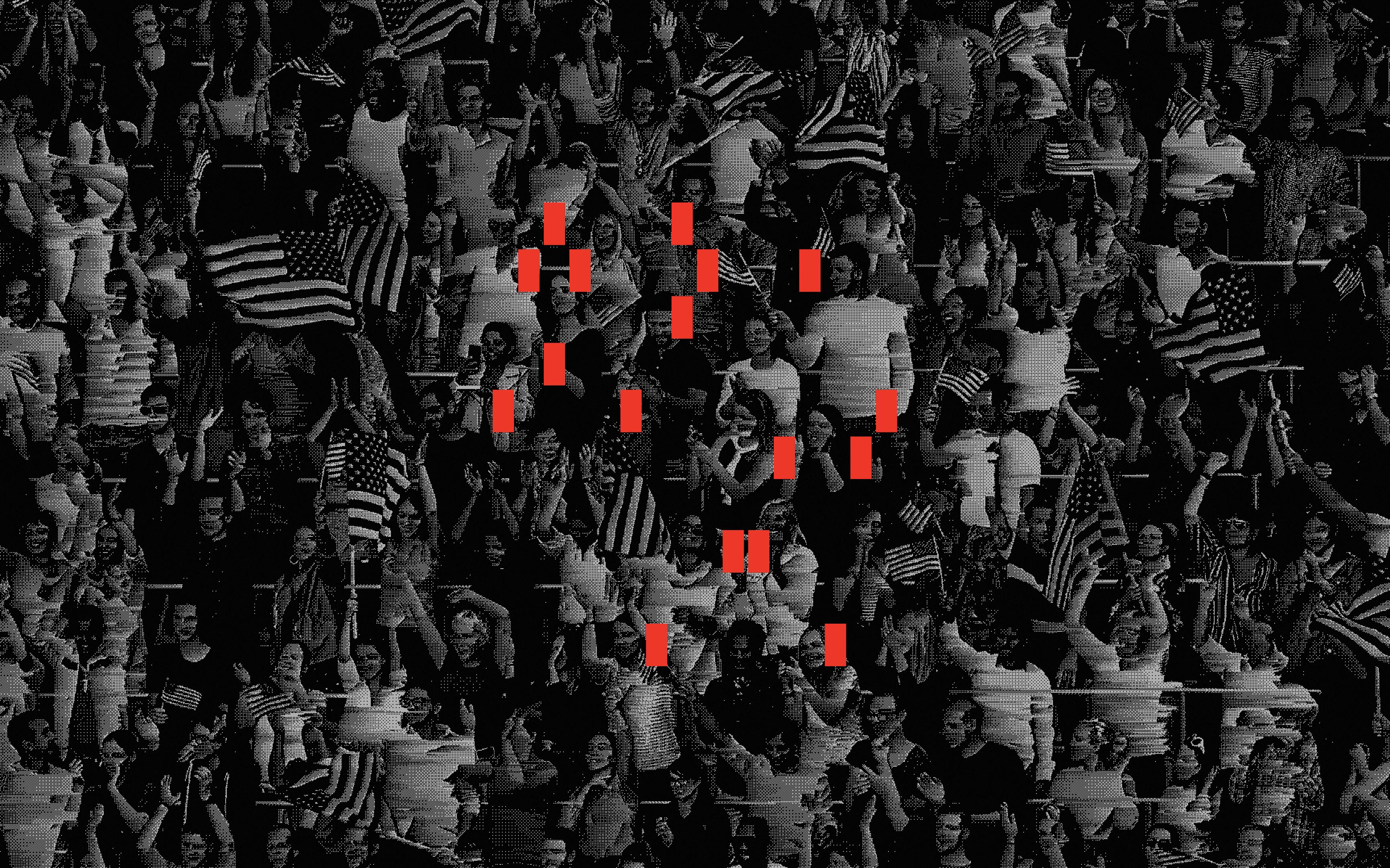
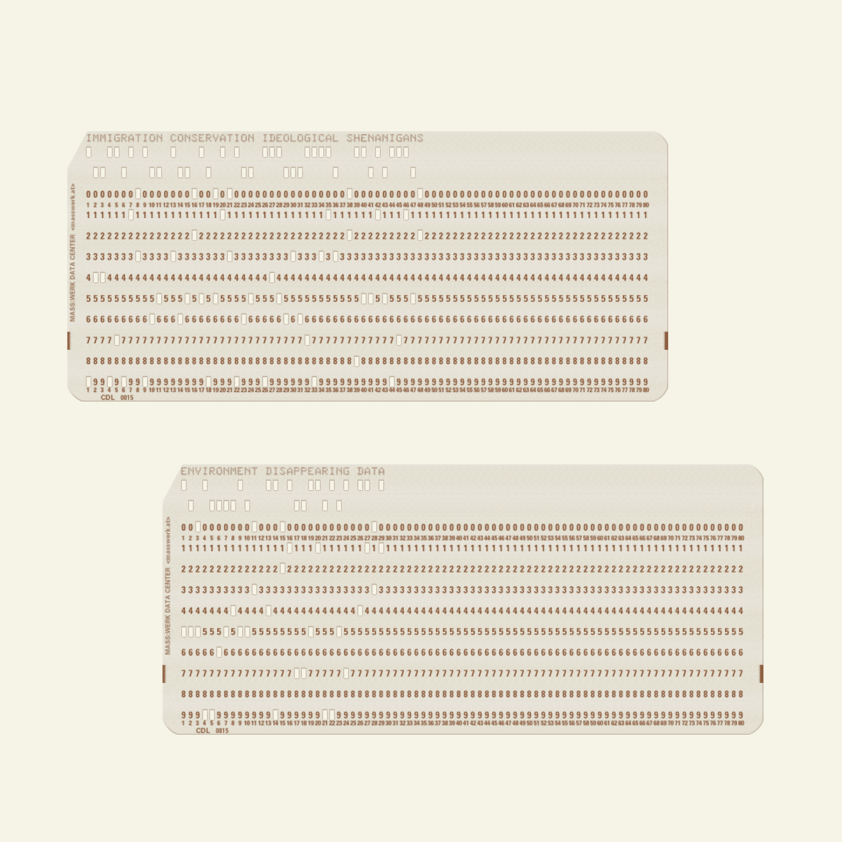
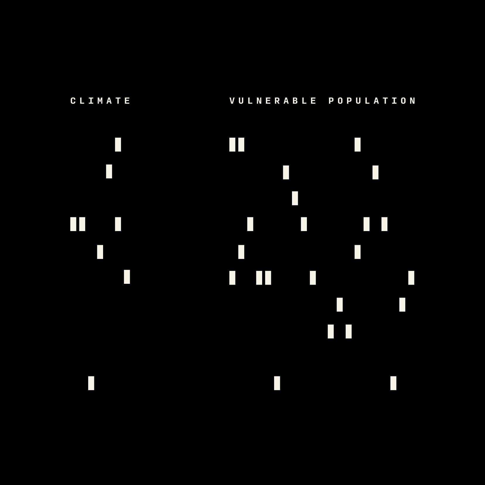
During our research we came across data punch cards from the 1970’s (that are still in active use by the US government). We converted each section’s title into a punch card pattern and used these as a visual motif across the eight core topics.


Scrolling and glitching
The scroll-driven image glitches are a clever piece of programming that takes chunks of photo data and randomly deletes lines of code.
It then copies data from the next image in the sequence and adds that code back into the original photo as you scroll and in real-time.
It’s a dynamic WebGL effect that connects the reader directly with the visuals and gives the site a unique visual footprint on every load.

Complex / Simple
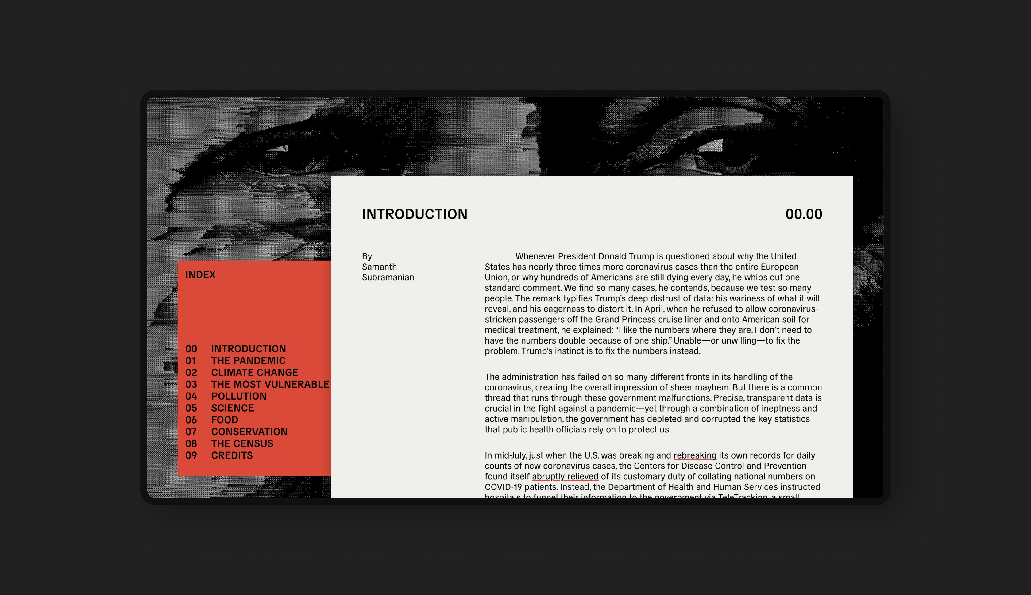
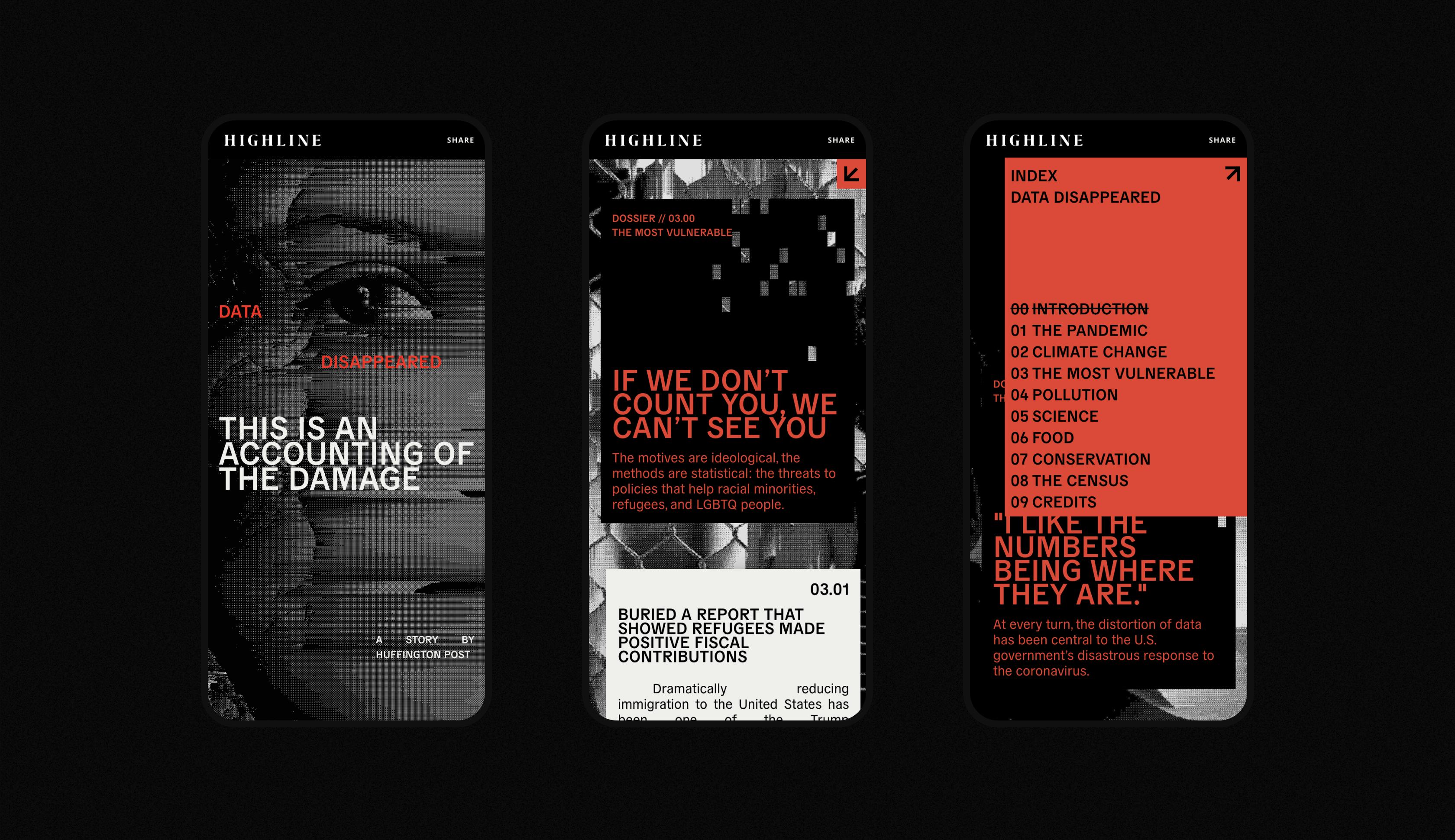
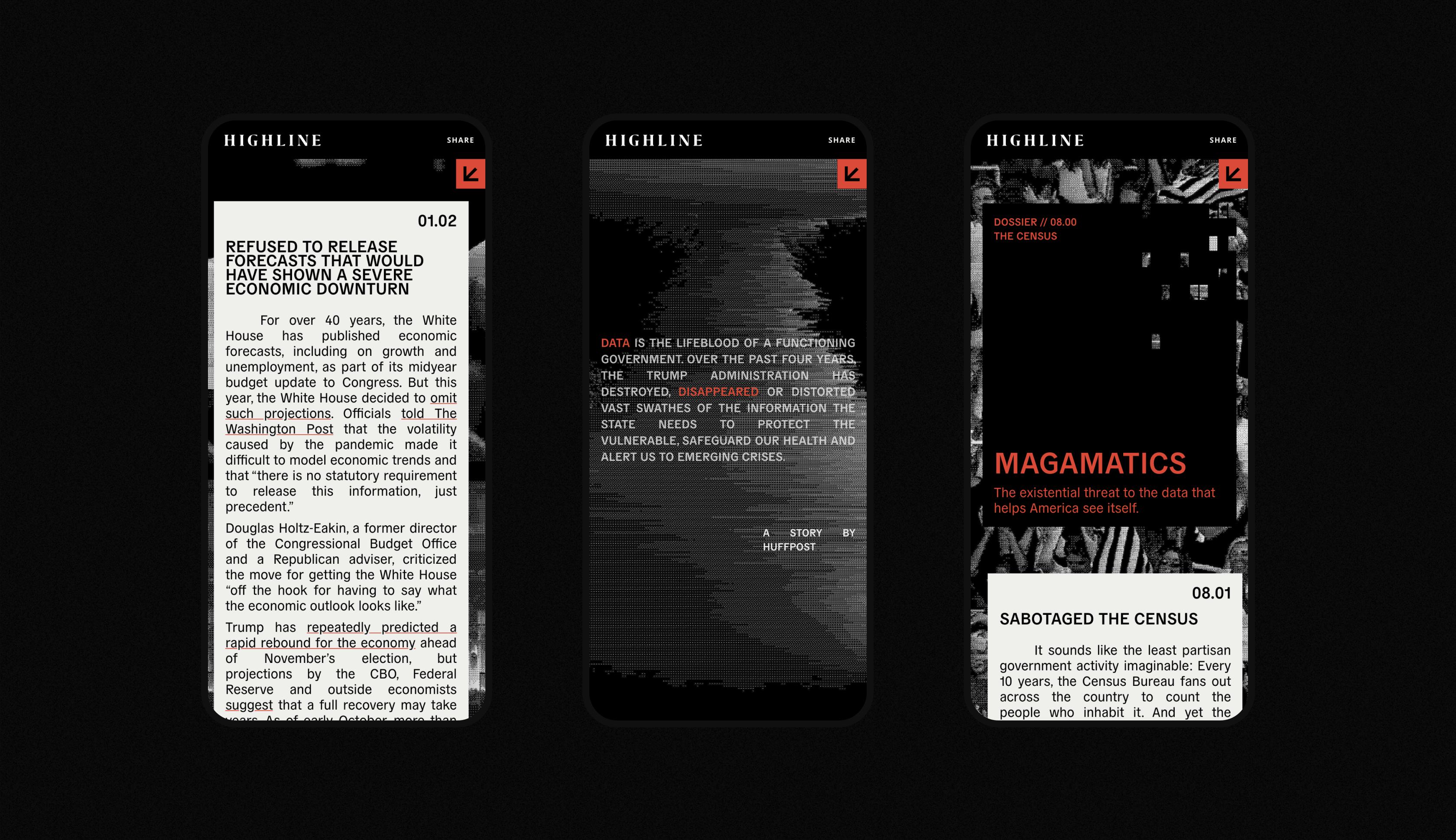
This project had a potentially complex structure – an extended introduction leading into eight chapters which each contained two to four unique articles.
We made the decision to keep all the chapters on a single page but ensure the chapter index was always visible, allowing readers to easily jump between subjects or pick up the site across multiple readings.


Balancing act
Finding a balance between content and visual effect without taking away from either is challenging with a story that is reliant on such a high volume of words.
Working closely with Highline’s editorial team to successfully navigate this path resulted in a storytelling experience that delivered a hard-hitting message in a uniquely beautiful way.


“We love getting the opportunity to research and derive design elements from the subject and source material.”
Asher Pilbrow
Senior Designer, Gladeye